Chase Mobile
A discovery project to concept a new Chase mobile experience

User Empathy
Interviewed and observed various segments of Chase customers / potential customers

Synthesis & Ideation
Reflected on learnings through group de-briefs, affinity diagramming, and the creation of personas and journeymaps

Experience Design
Concepted, tested, and refined design solutions to identified needs through sketching, wireframing, and prototyping

Visual Design
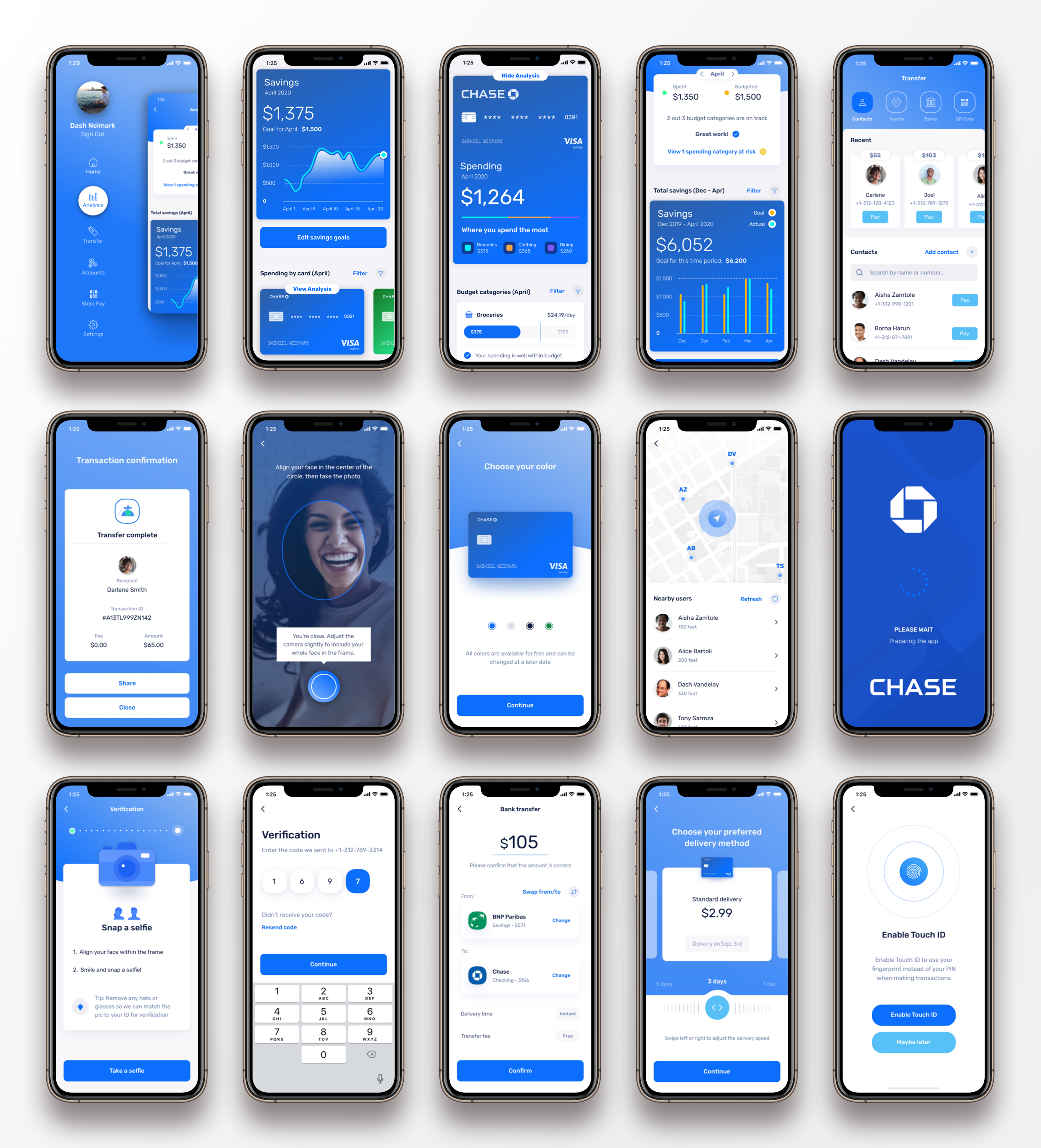
After validating ideas with internal and external stakeholders, I created hi-fidelity mockups and dev-ready documentation
Table of Contents
01
Project Intro
What we worked on, overview of deliverables, interactive prototype, project logistics, & KPIs
Problem Statement
Chase came to us because they were lacking user engagement for their mobile experience, which largely just replicated the content and structure of the web experience for Chase customers.
What I Worked On
Chase was looking to reimagine their mobile experience both experientially and visually and have a new set of ideas proposed to enhance user engagement.
They wanted me to analyze their existing mobile app, perform some user research, and understand what might be causing a lack of engagement.
After engaging in some discovery user research and then prototyping, testing, and refining potential ideas, I came up with a set of recommendations for a new mobile experience.
This new design direction trimmed the fat by removing many features that users felt were unnecessary in the current mobile app and instead polished the core features that users truly wanted in a mobile context.
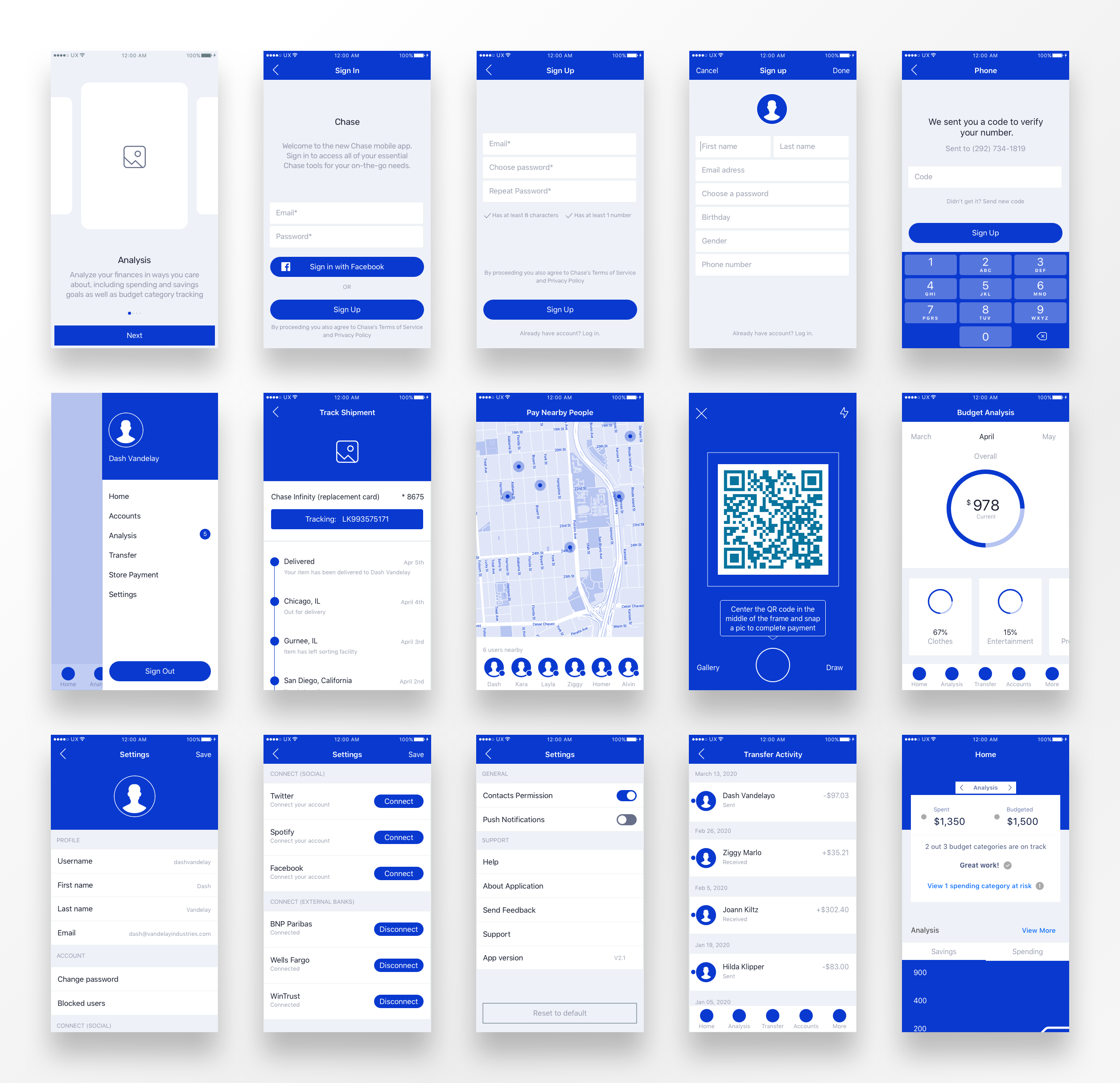
Deliverable Overview
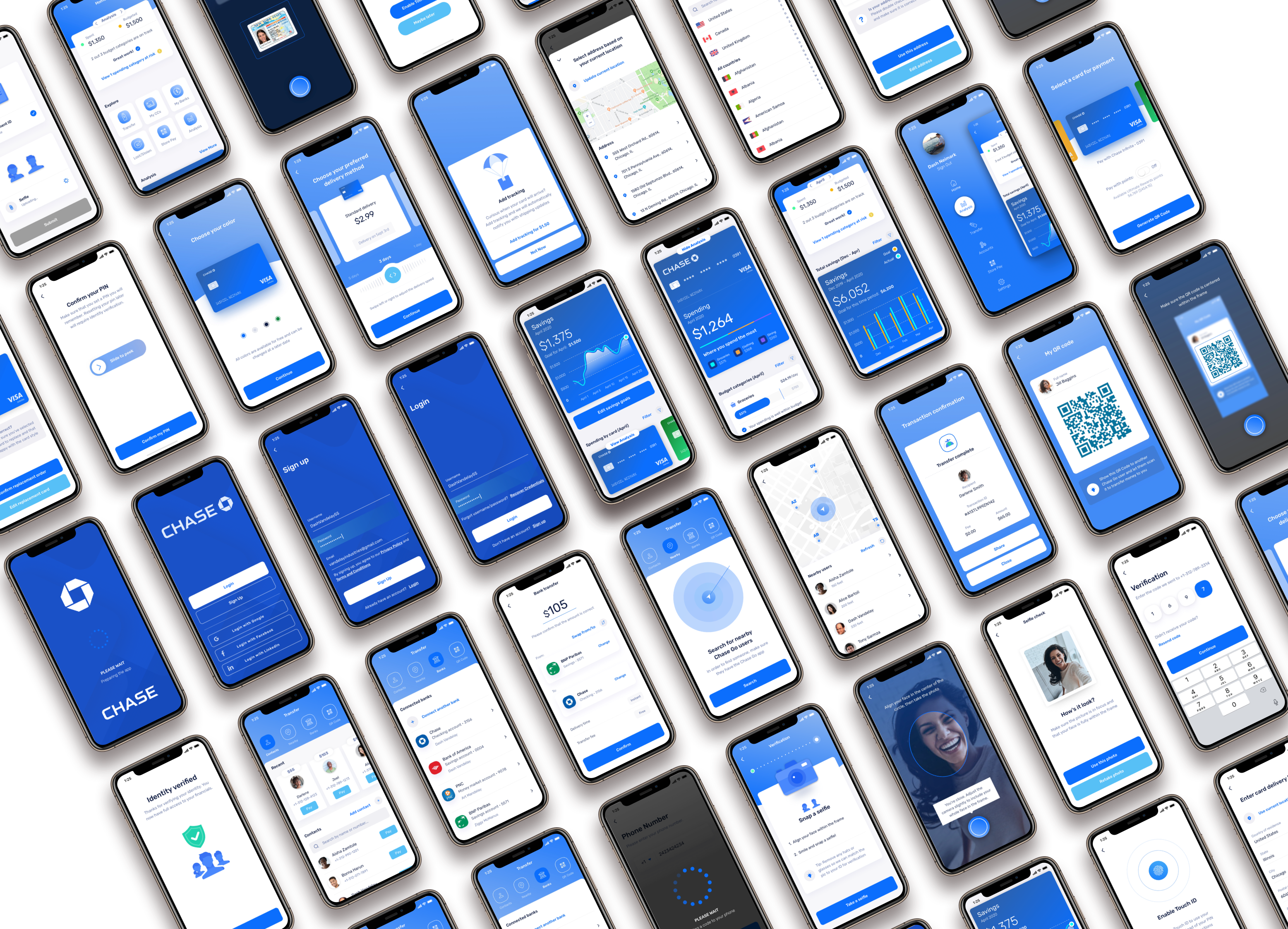
Over the course of this project, some of the deliverables I created include sketches/wireframes, hi-fidelity mock-ups, interactive prototypes, personas, journeymaps, user flows, a red route, a sitemap, and a feature prioritization matrix.
Throughout this case study, I’ll explain how these outputs were developed and what role they played in our overall product design process for Chase.
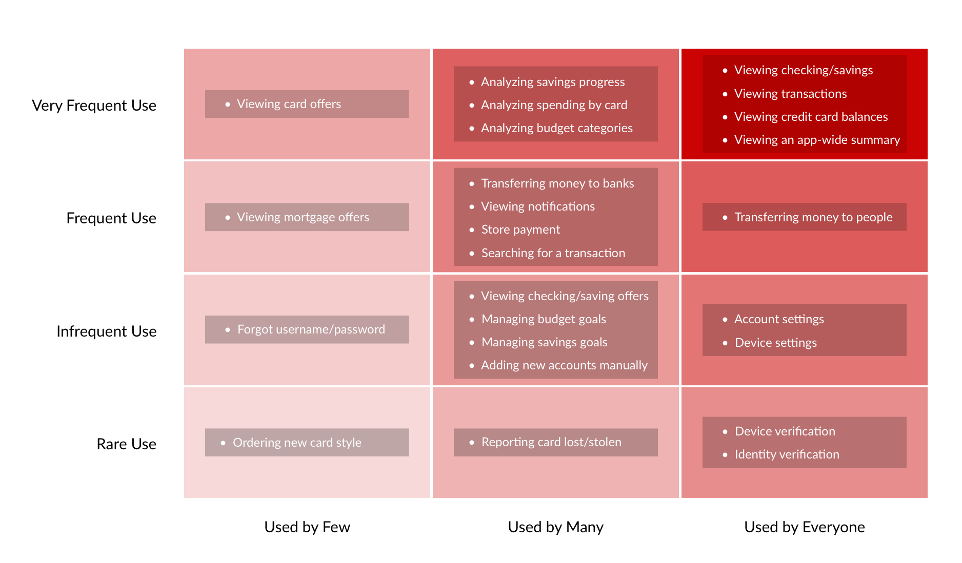
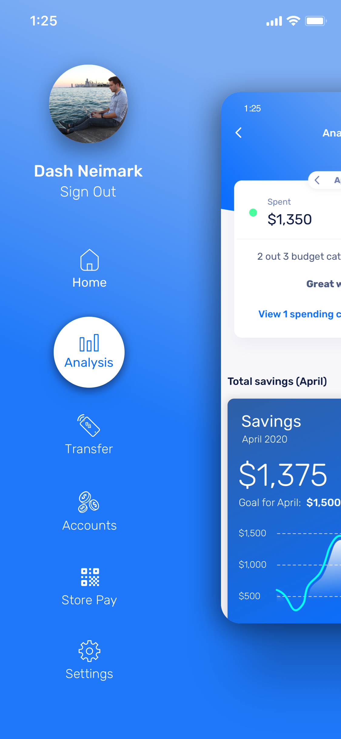
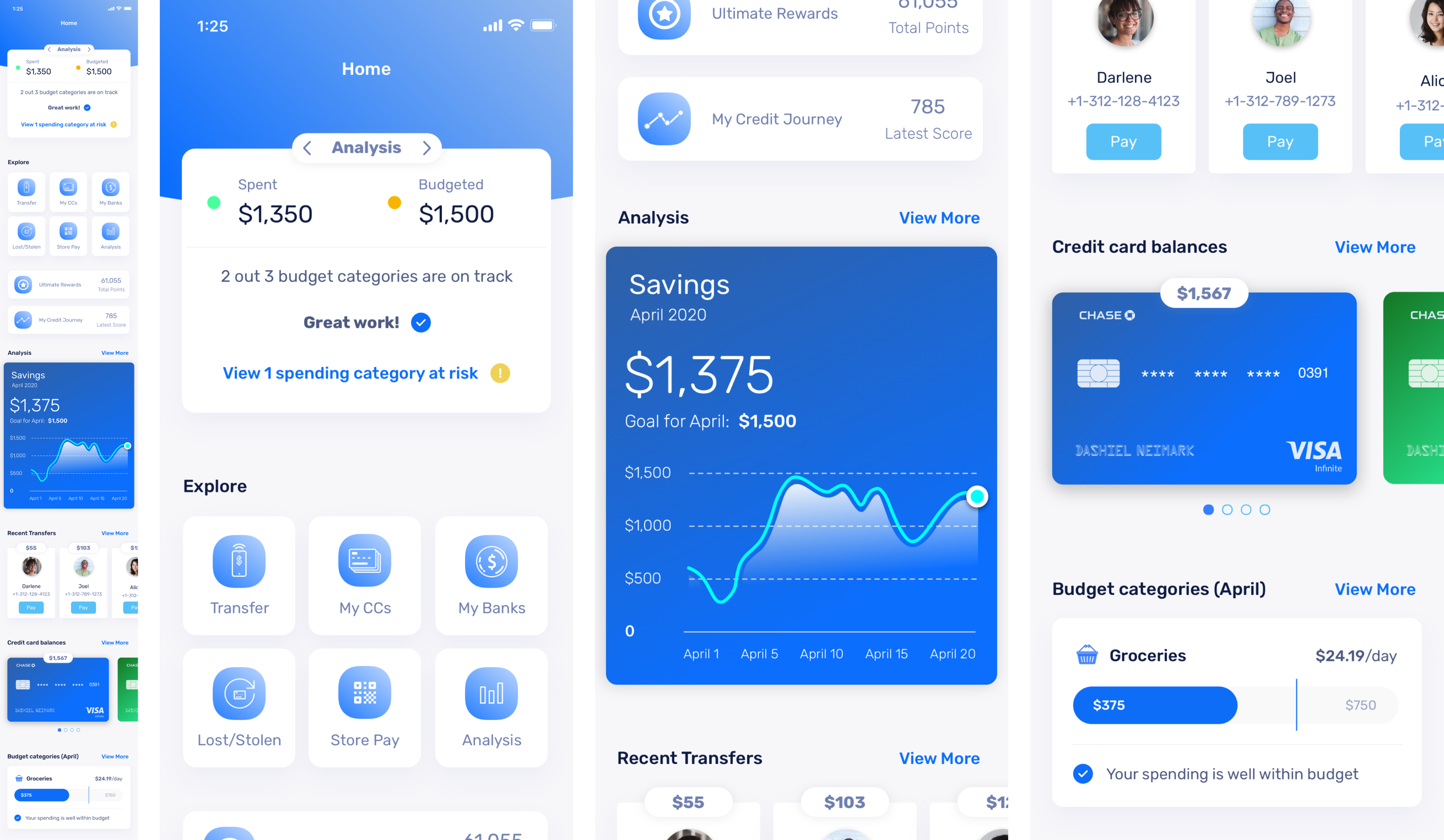
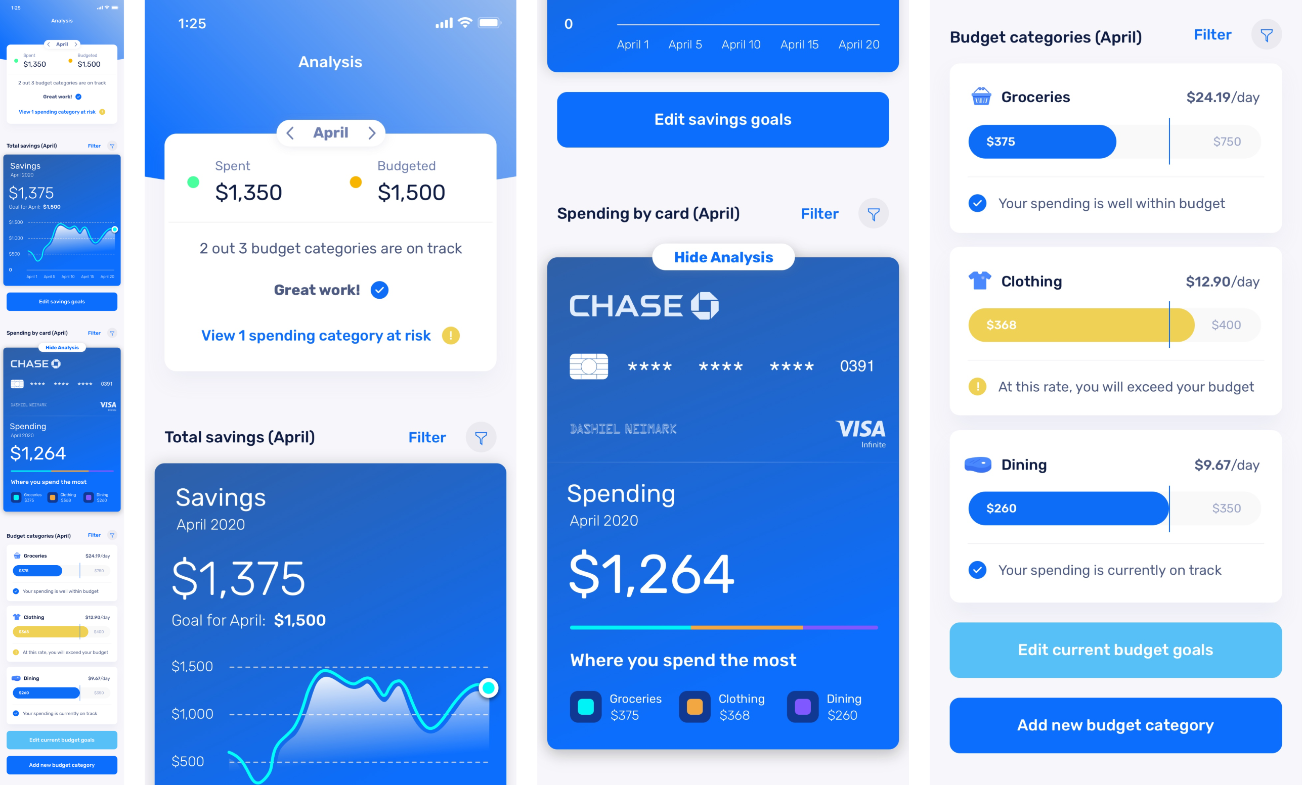
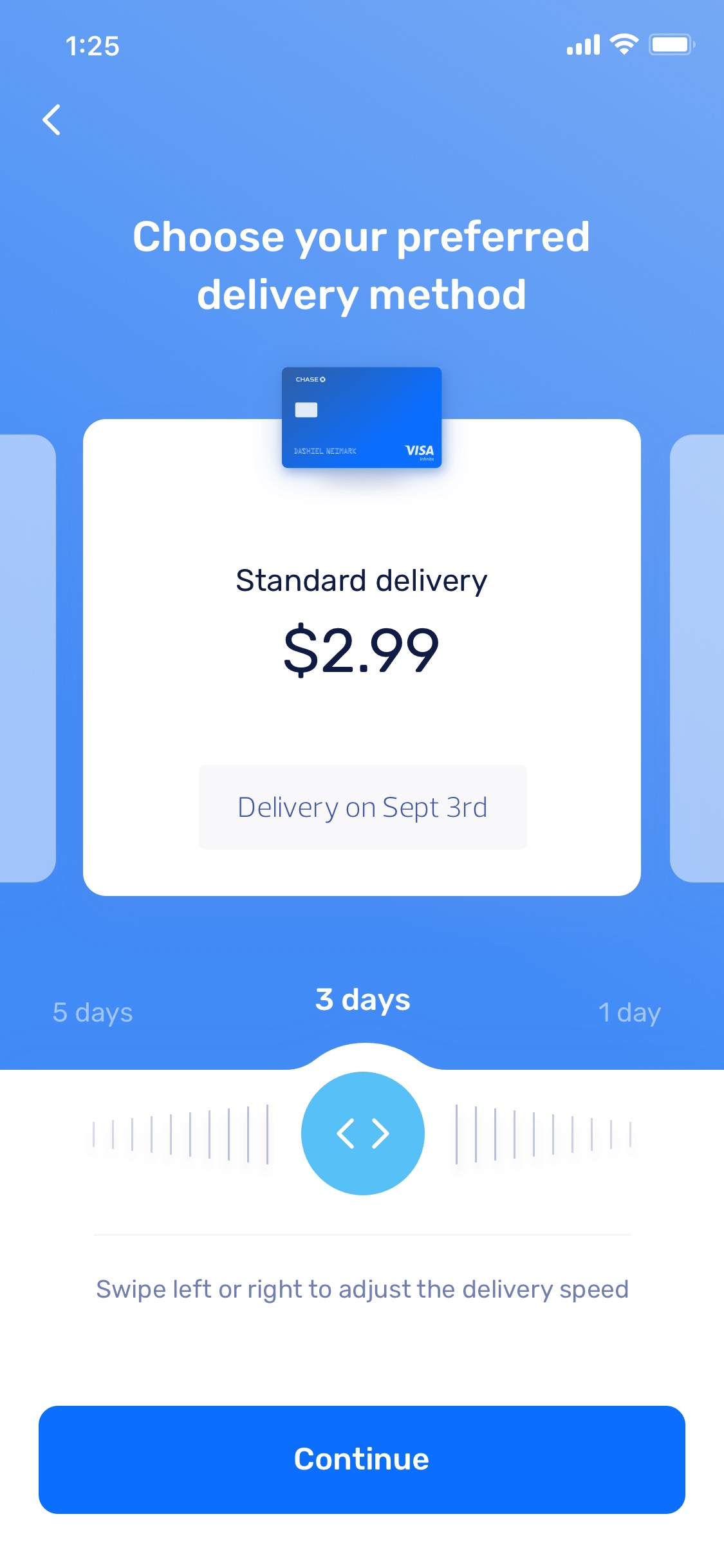
Spending & Savings Analysis
Define savings goals and analyze financial activity over various time periods
Transfer
Transfer money to contacts, nearby users, and banks
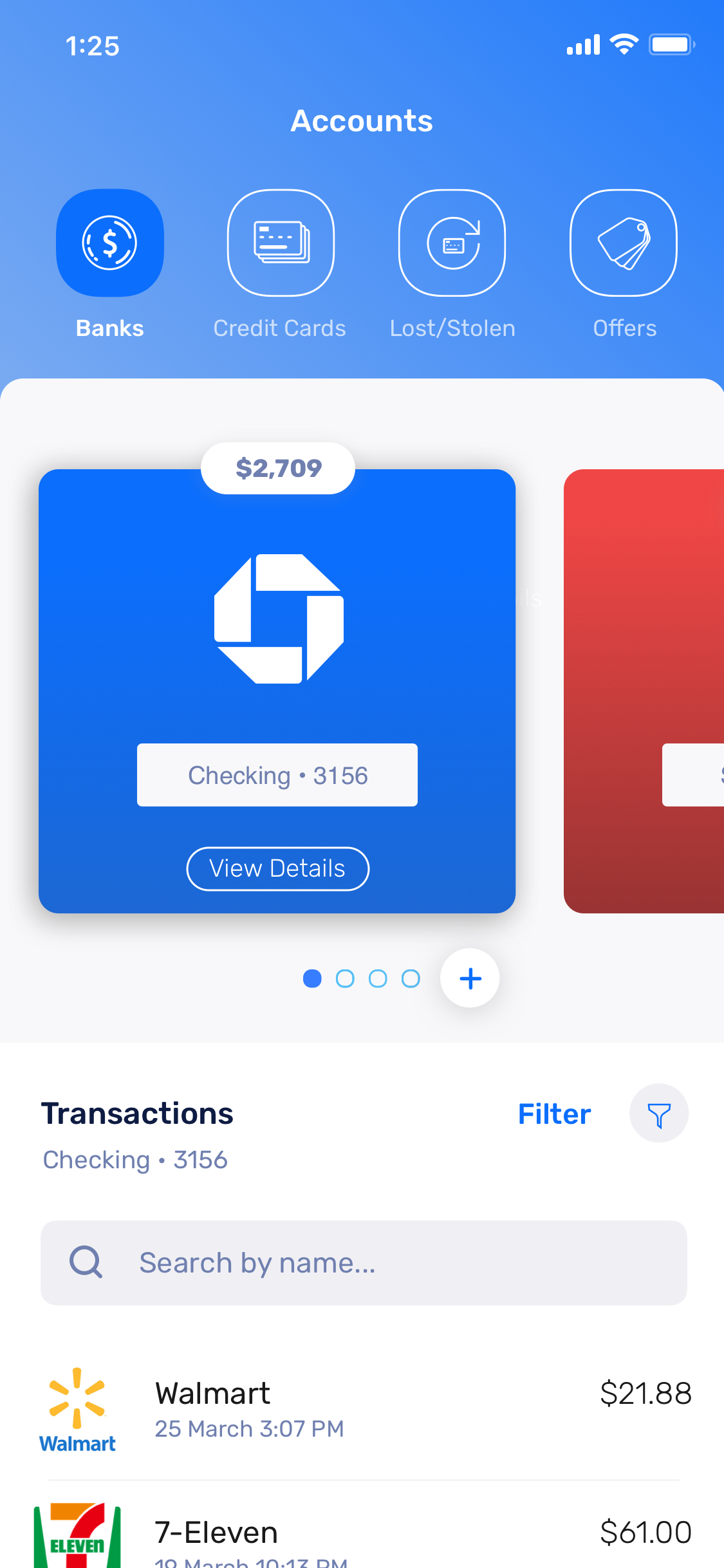
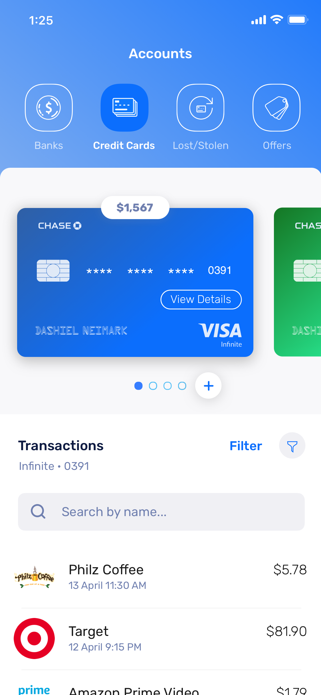
Accounts
Check up on bank accounts and credit cards and view balances and transactions
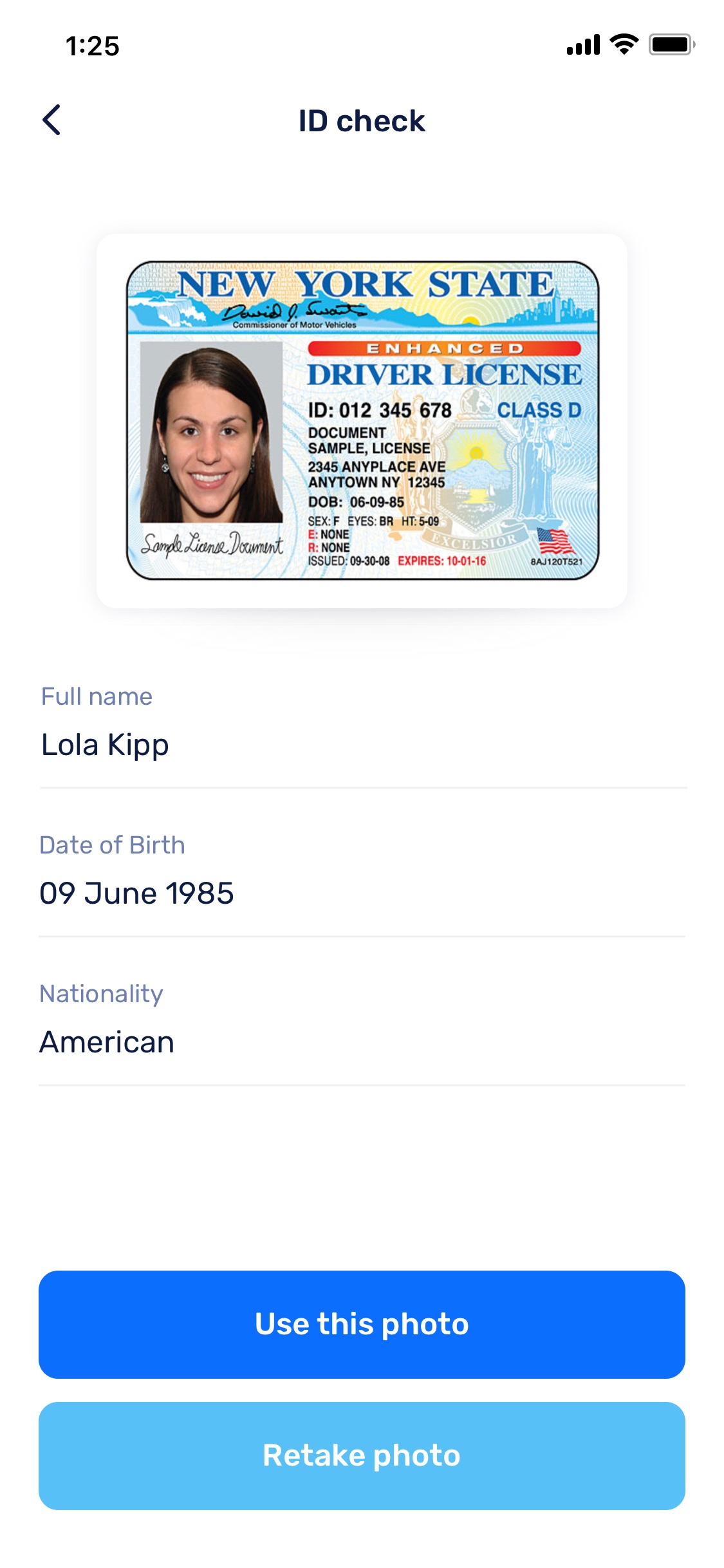
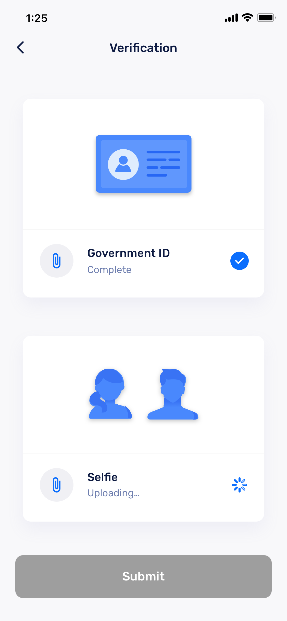
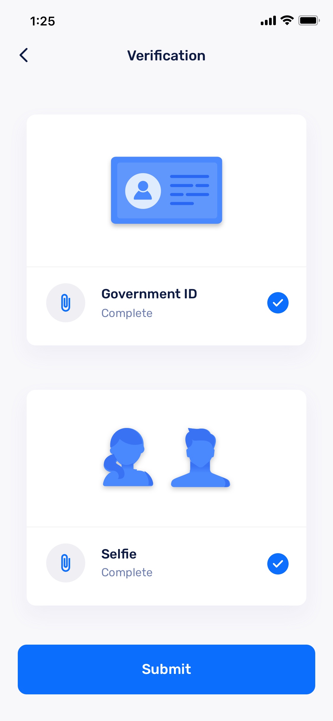
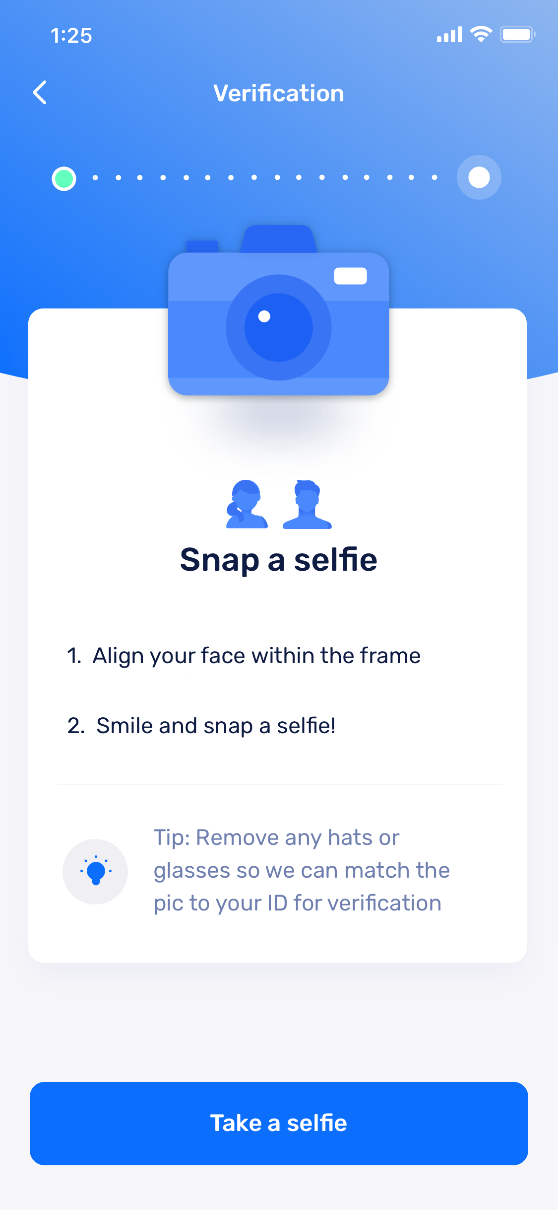
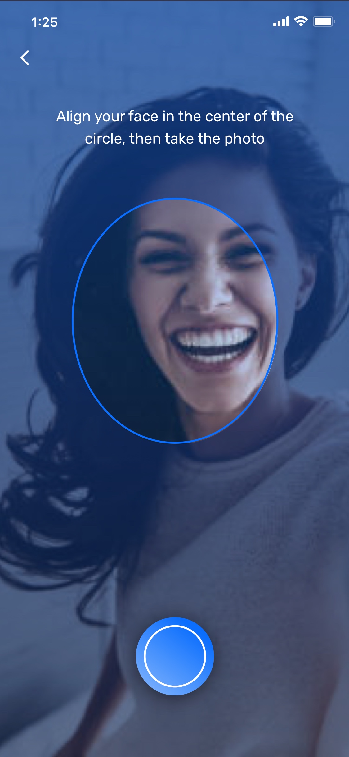
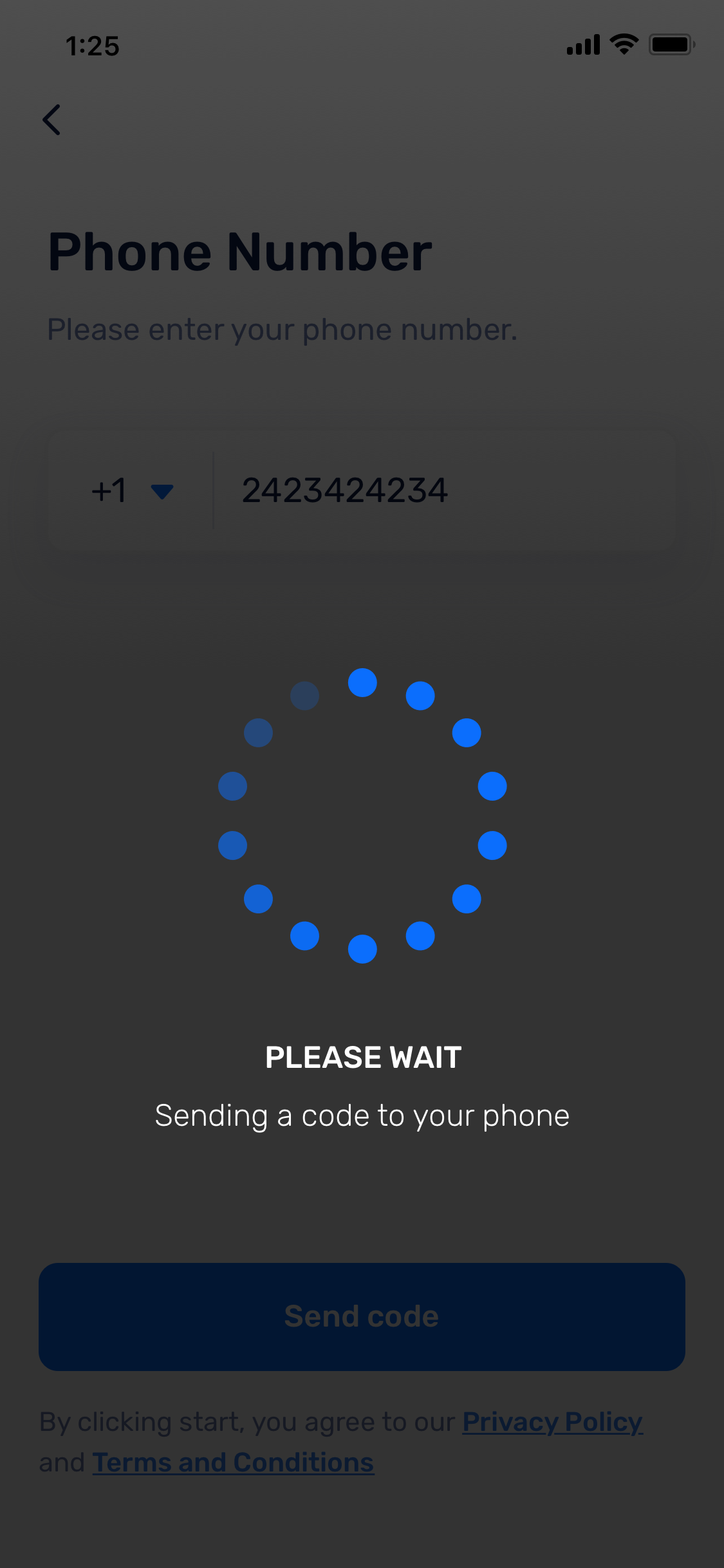
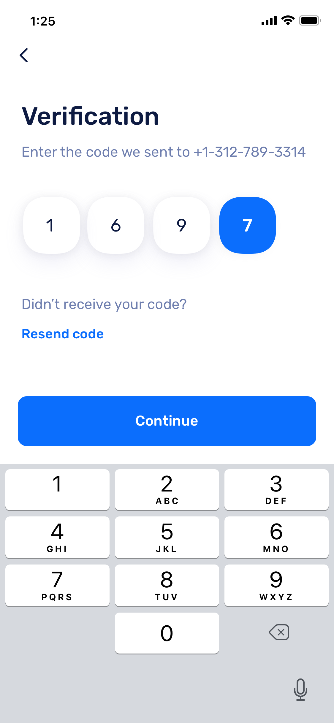
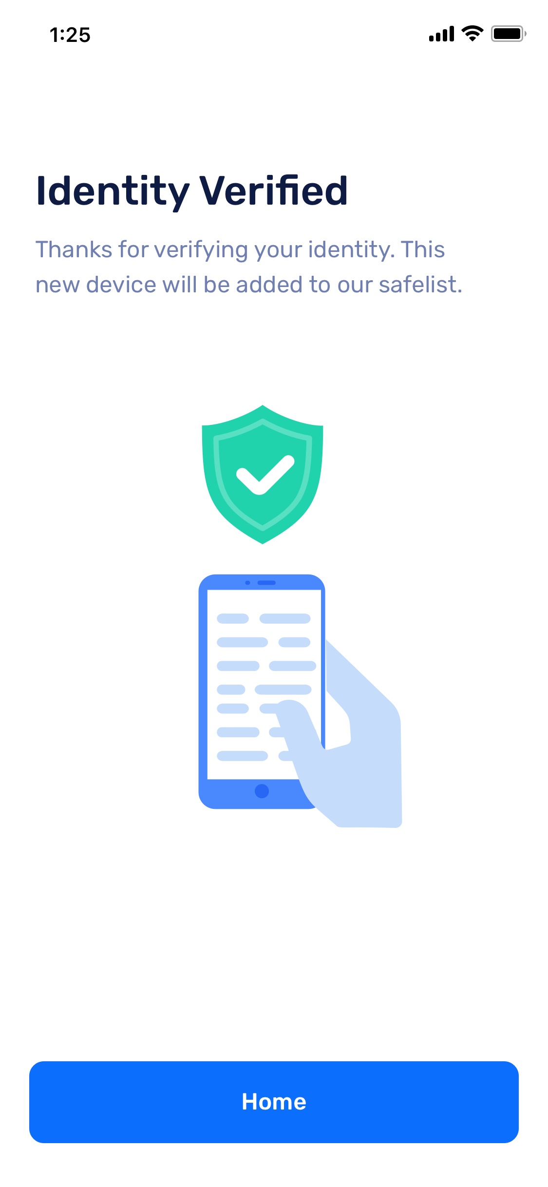
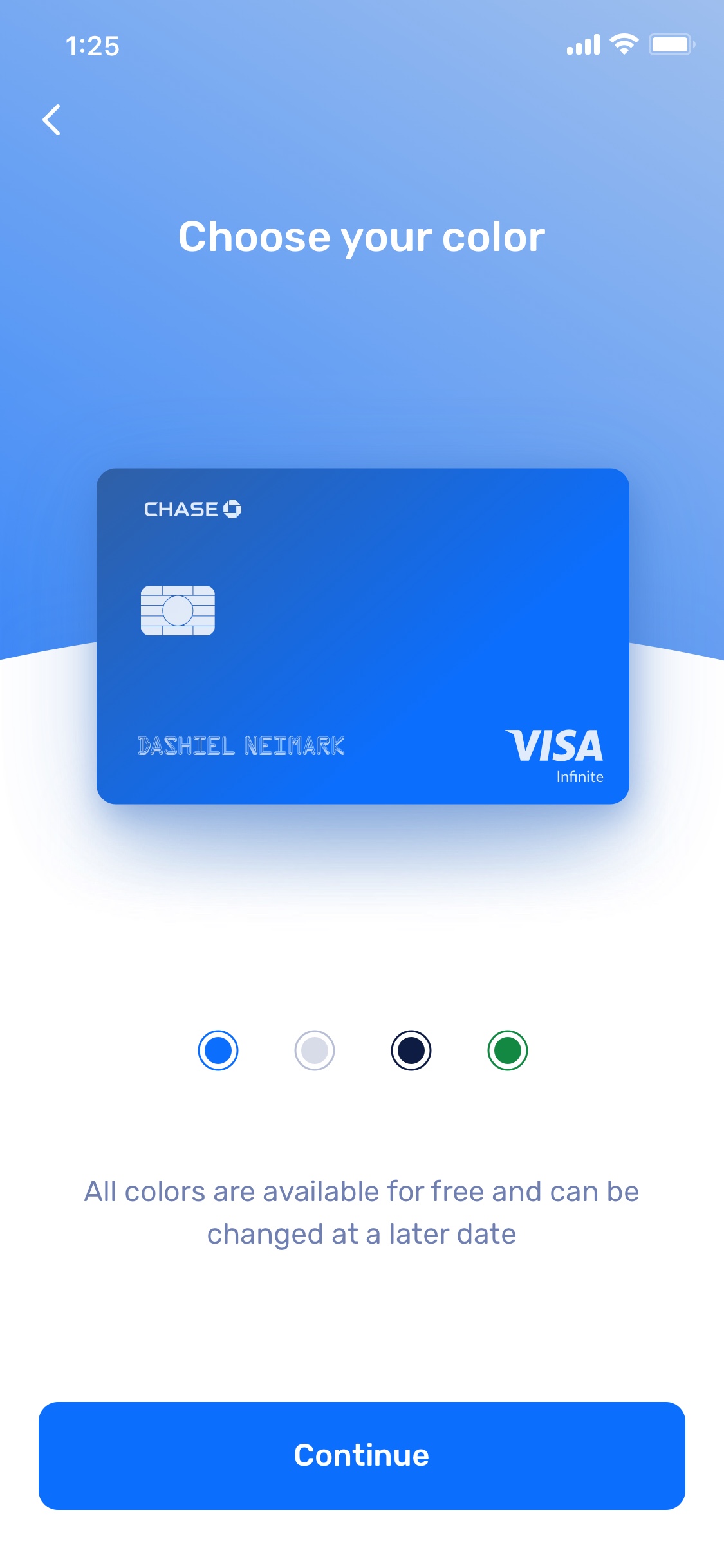
Interactive Prototype
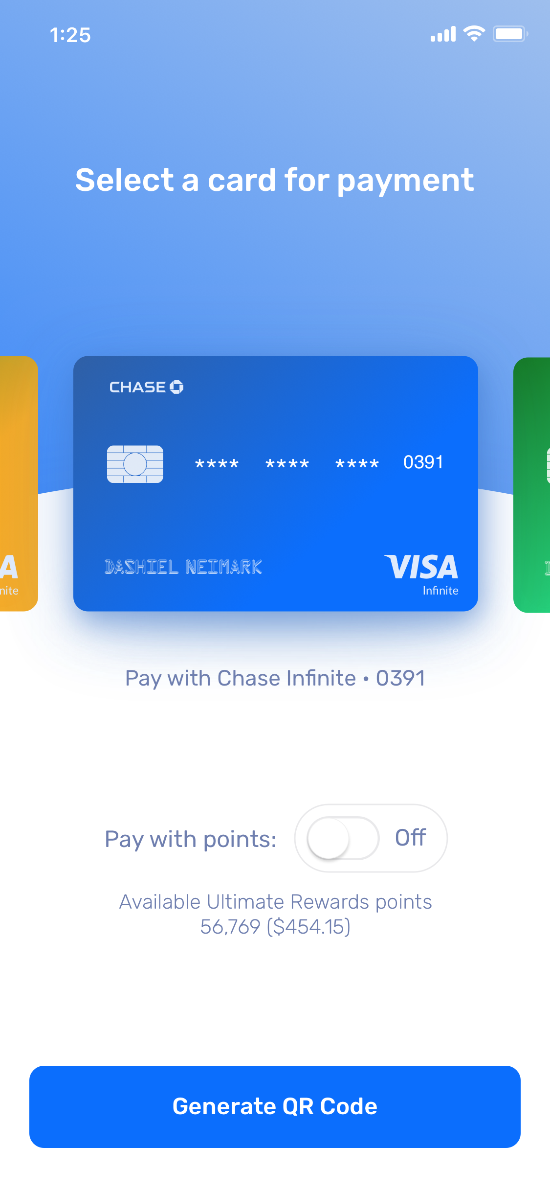
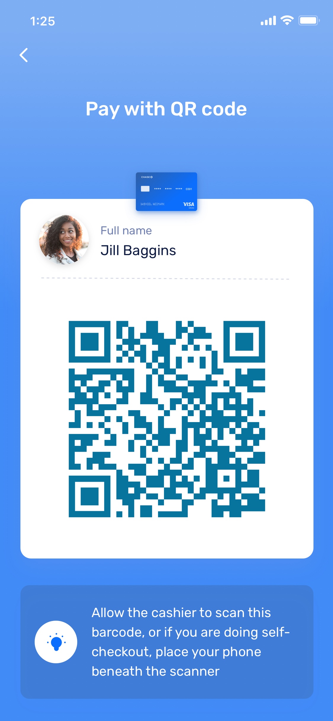
Store Payment
Quickly pay for items in-store with any of your cards and/or use your Chase Ultimate Rewards points
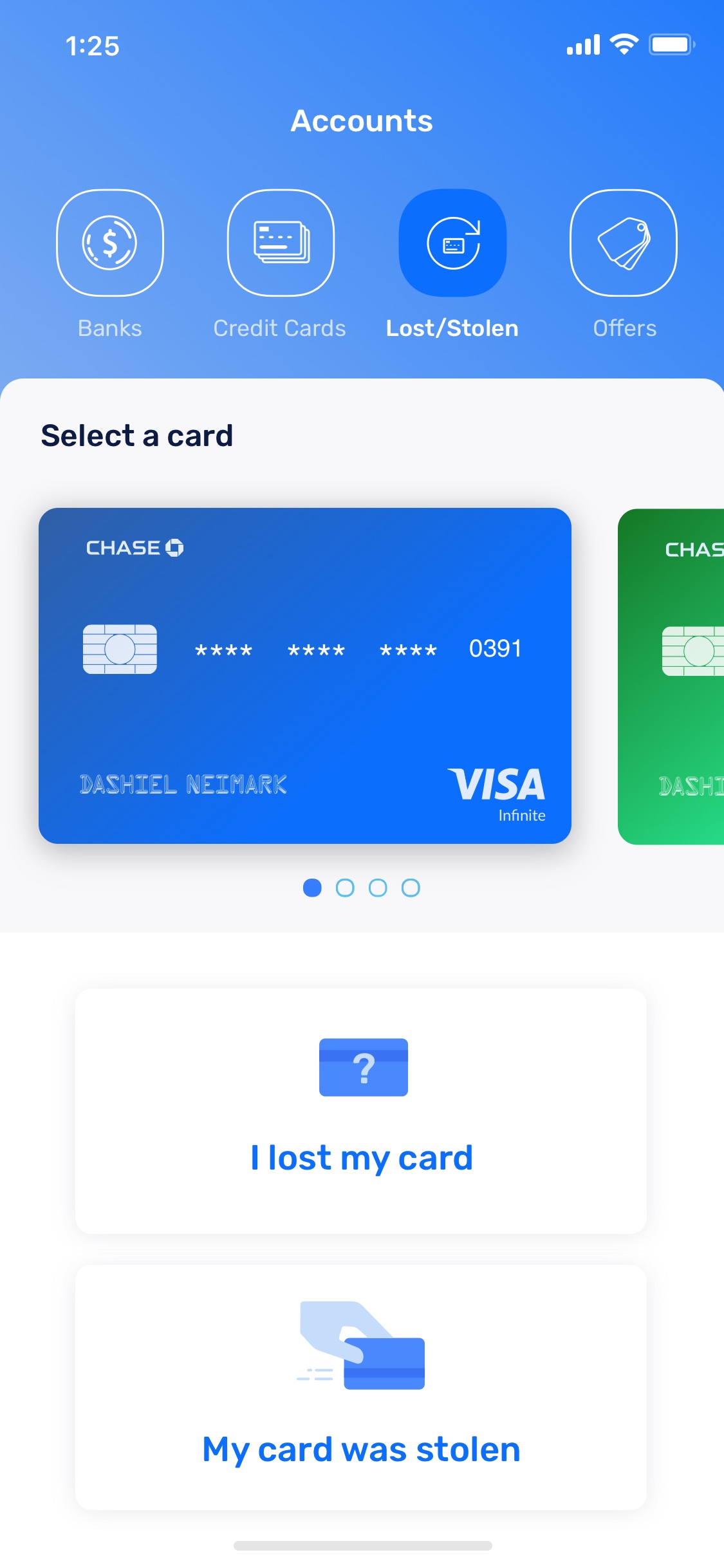
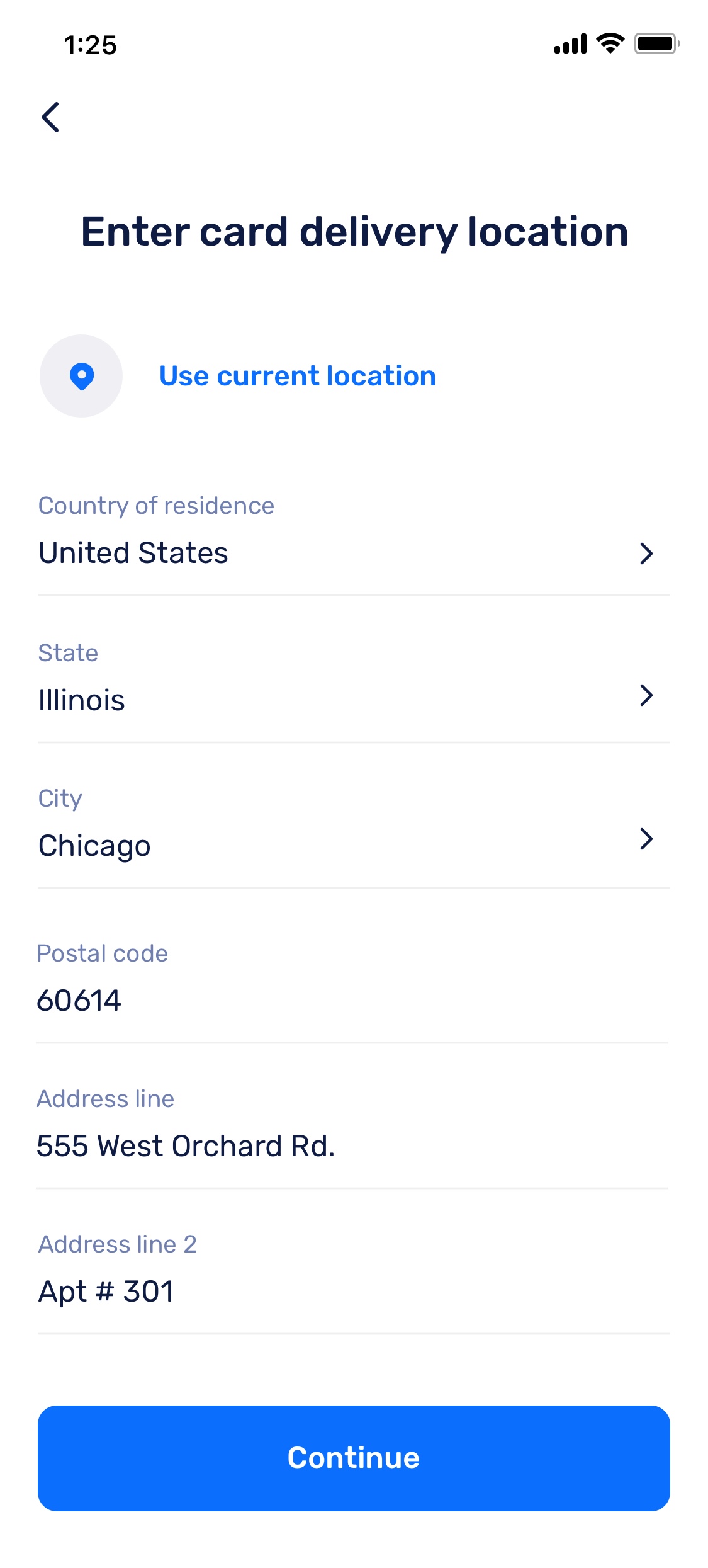
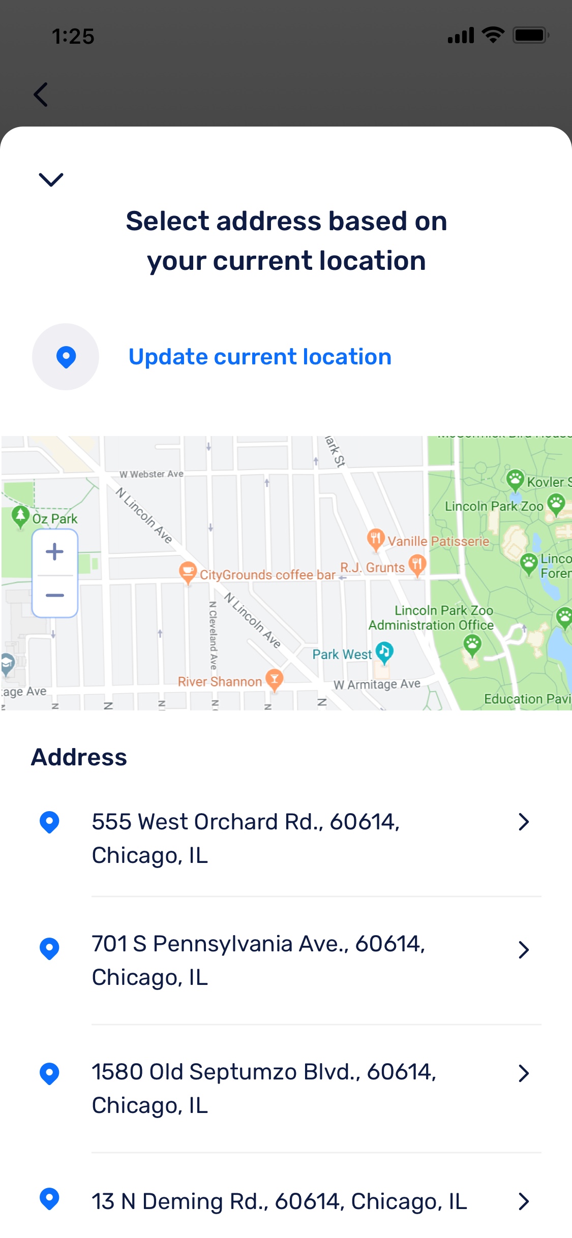
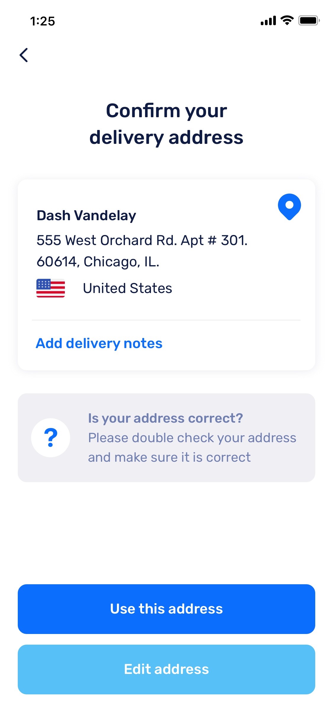
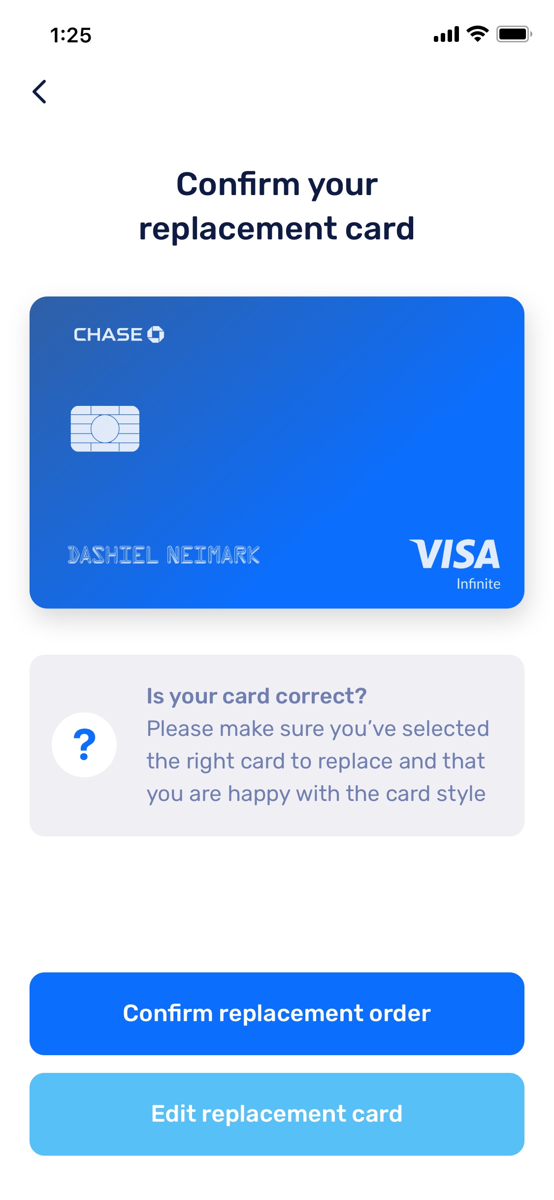
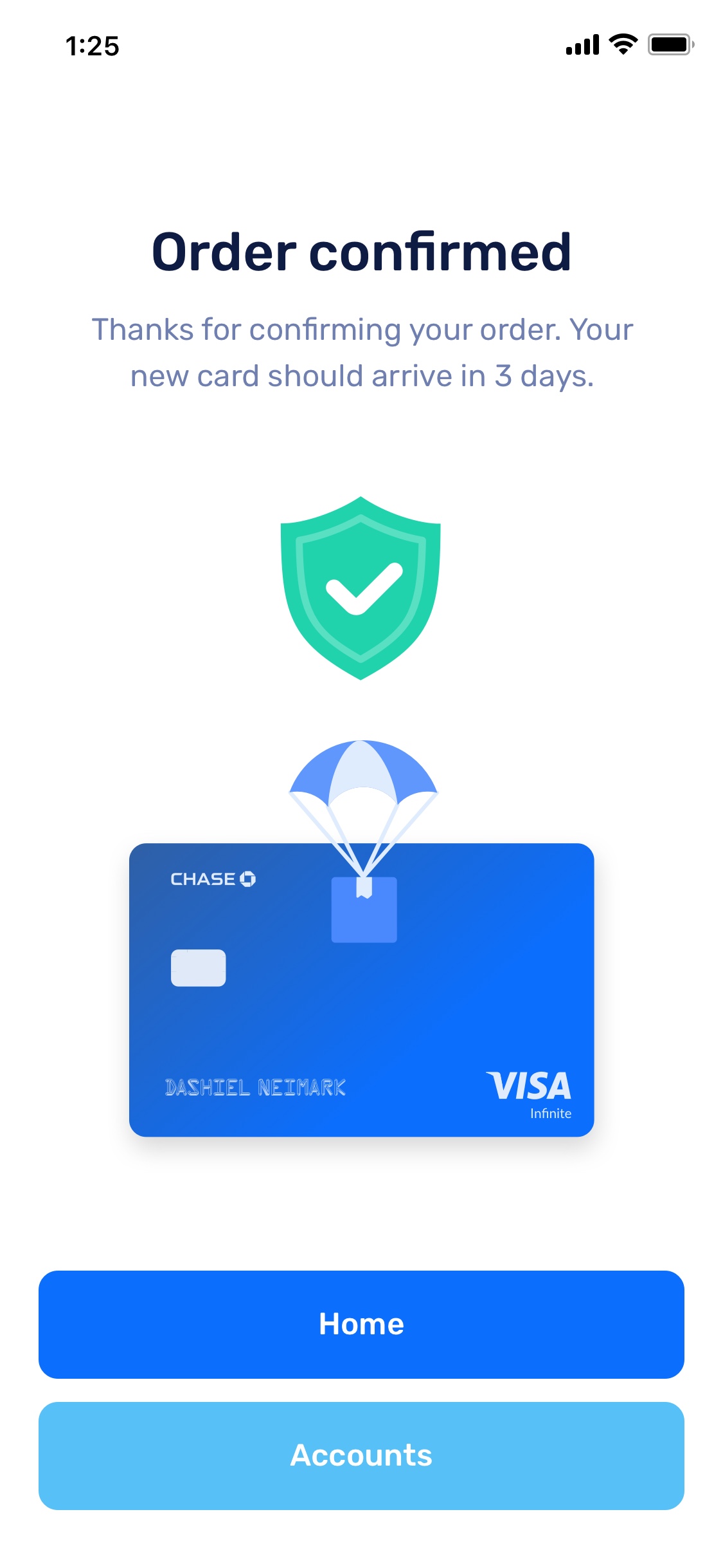
Replace Lost/Stolen Card
Report a card lost or stolen and order a replacement with the design of your choice
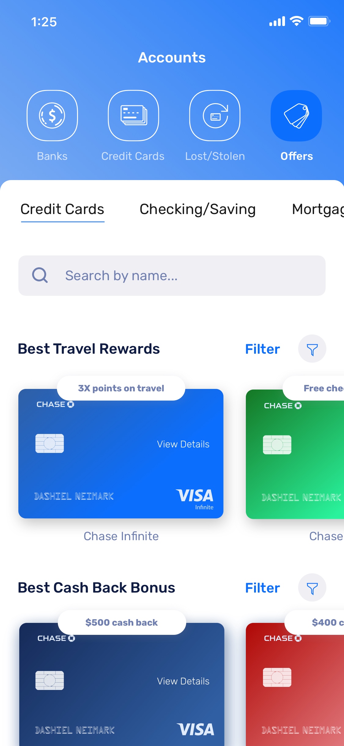
Offers
View and accept offers for new credit cards, checking/savings accounts, and mortgages
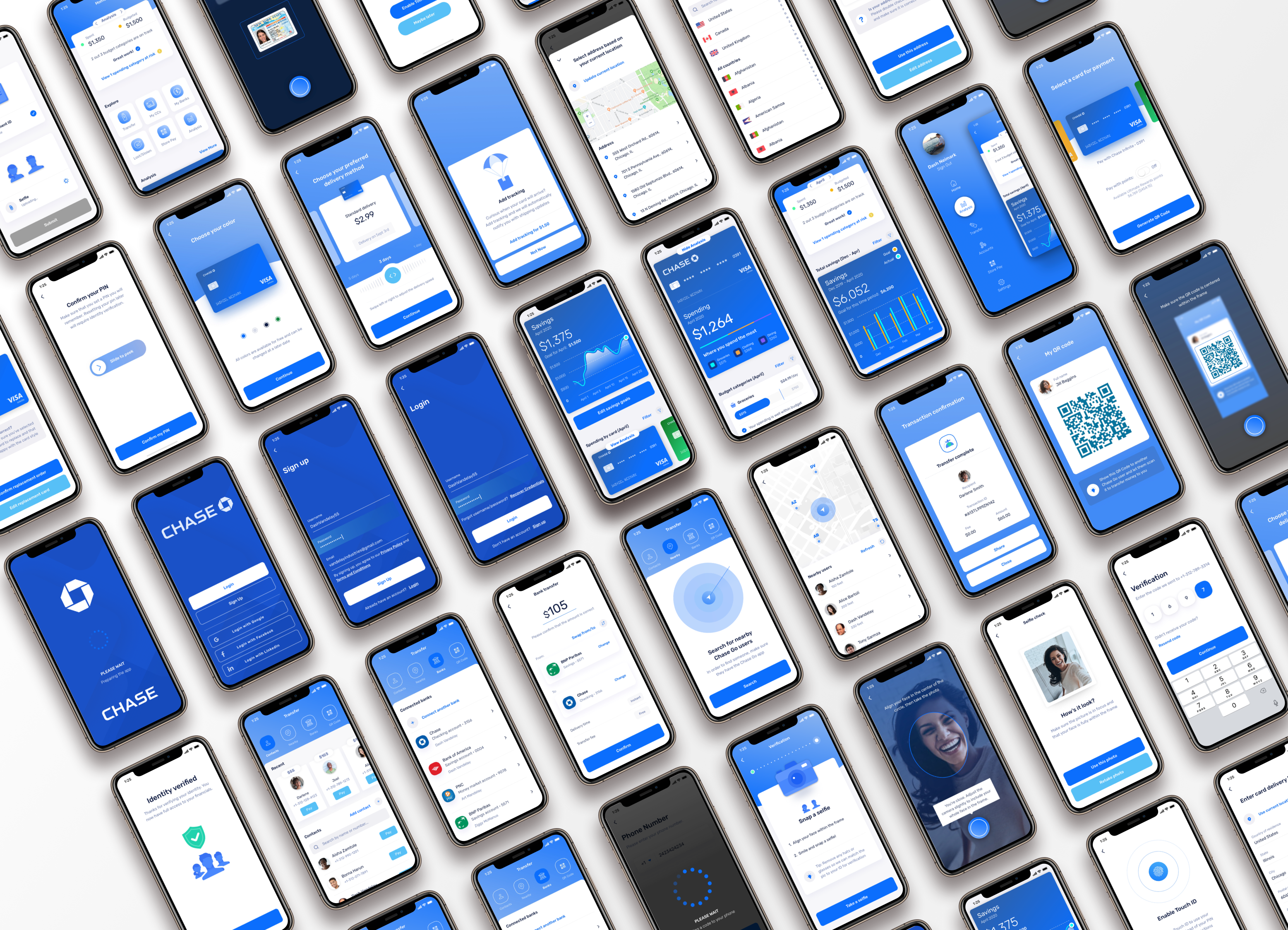
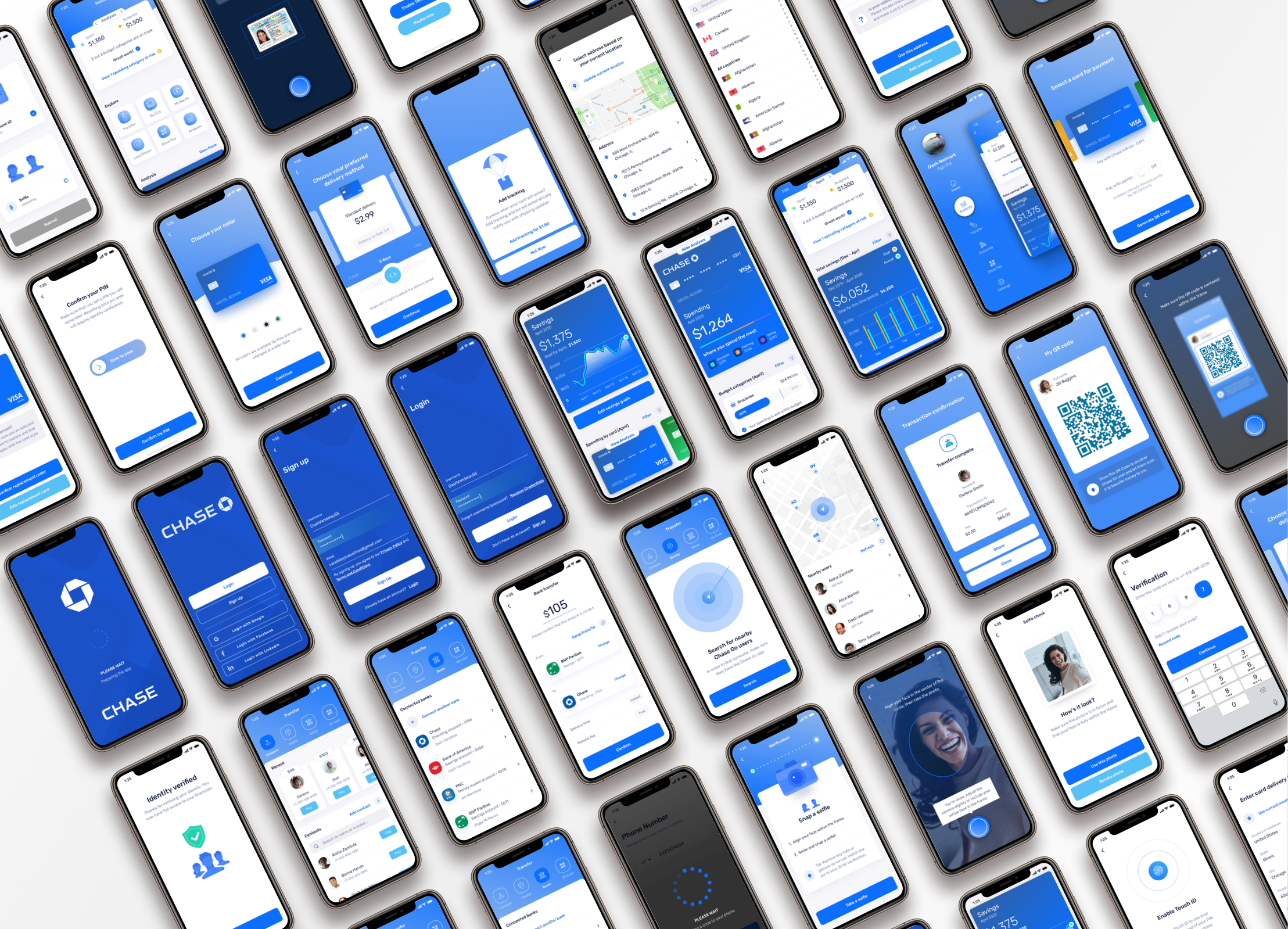
Mock-up Gallery
Project Info
Chase asked us to figure out why engagement was low for their current mobile experience and propose a redesigned application that customers would actually want to use.
To do this, we did a UX discovery project where we analyzed the current mobile experience, identified pain points and opportunity areas, and prototyped a new experience (first focusing on the iOS app) that trimmed the fat and offered features and content that customers would find more engaging.
This project was completed over 16 weeks. This included discovery research, wireframing, prototyping and hi-fidelity design for the iOS app.
After handing off our discovery work to Chase, our consulting engagement ended and the decision to implement this new experience in full, or simply aspects of it into their existing app, is now being decided by an internal team at Chase.
Internally, I collaborated with Chase business stakeholders to make sure design concepts were grounded in business goals, developers to discuss feasibility of implementation, and a UX researcher to formulate research plans, synthesize findings, and brainstorm ideas.
Externally, I frequently involved target users of the current Chase mobile experience and similar competitor apps to develop insight assets and gather feedback on design concepts.
My responsibilities were to lead design and research.
On the research side, this included collaborating with the UX researcher to define a research plan based on insights sought, conduct interviews/observations, synthesize findings, and create personas, journeymaps, and other insight assets.
On the design side, I lead the full cycle of design from early stage ideation via sketching/whiteboarding/wireframing, through clickable prototypes, hi-fidelity mockups and development-ready documentation.
The outcome of this project was that we established a new experiential direction for Chase’s mobile experience, validated both by users and business stakeholders.
Because the application has not yet been implemented and launched, KPIs have not been measured — though they have been defined, which I go over in the section below.
Tying Design to Business Impact
Defining KPIs
In order to make sure that the experience we designed actually resulted in improvements over previous mobile apps for Chase, we defined KPIs to be measured if/when the new app we concepted would be implemented.
Ideally, we wanted users to be satisfied and leave positive reviews, be active and consistently return to the app, and perhaps most importantly, we wanted the app to pose genuine value so that user acquisition would be a more natural (and less paid) process based on creating an experience that meets market needs in a delightful way.
This discovery engagement primarily resulted in a set of strategic recommendations for what the Chase mobile experience should aim to prioritize as their core experience: Spending & Savings Analysis, Money Transfers, Account Details, and Store Payment.
Shortly after redefining the Chase mobile experience, we saw positive improvement in the KPIs we collaboratively defined with the team.
User Satisfaction Rating
+
0
%
Daily Active Users
+
0
%
Churn Rate
-
0
%
Cost Per Acquisition
-
0
%
02
Process Overview
A quick overview of my process and how the activities throughout culminated into a proposed set of designs
Process Overview
Low-fi Ideation
Rapidly exploring many ideas, I sketched out a ton of potential ideas which could later be discussed in greater detail to create a feature shortlist for continued design.
Wireframes & Iterative Refinement
Quickly and iteratively took initial ideas, put them to the test in clickable wireframe prototypes, gathered feedback, and refined until concepts were validated and ready for the visual layer.
Prototypes & Hi-fi Design
As low-fidelity concepts moved closer to validation, I created hi-fidelity mockups and prototypes and continued gathering feedback at a more detailed level.
03
Empathy
What we set out to learn and how we captured insights in personas, user stories, and journeymaps
Intro
My process always starts with empathy. By better understanding our target users and mapping out their processes, pain-points, and future state desires, I’m able to focus my design efforts in a more effective way.
To do this, we defined what we wanted to learn about our target users and how we would go about extracting those insights. Once gathered, we then synthesized and summarized our highlight findings and used them to drive a more relevant set of features for the experience.
What We Set Out to Learn
We took a look at four main categories of questions while empathizing with users through interviews and contextual observations:
Frequent Processes
What do Chase customers (and users of similar services) typically do and why?
Needs
What do customers want that they aren’t getting in their current state experience?
Enjoyments
What sorts of things do customers enjoy about the current state experience and want to maintain?
Feature Shortlist
What do users consider to be excess functionality/content in a mobile context that could be trimmed?
Interviews
Contextual Observations
Insight Themes
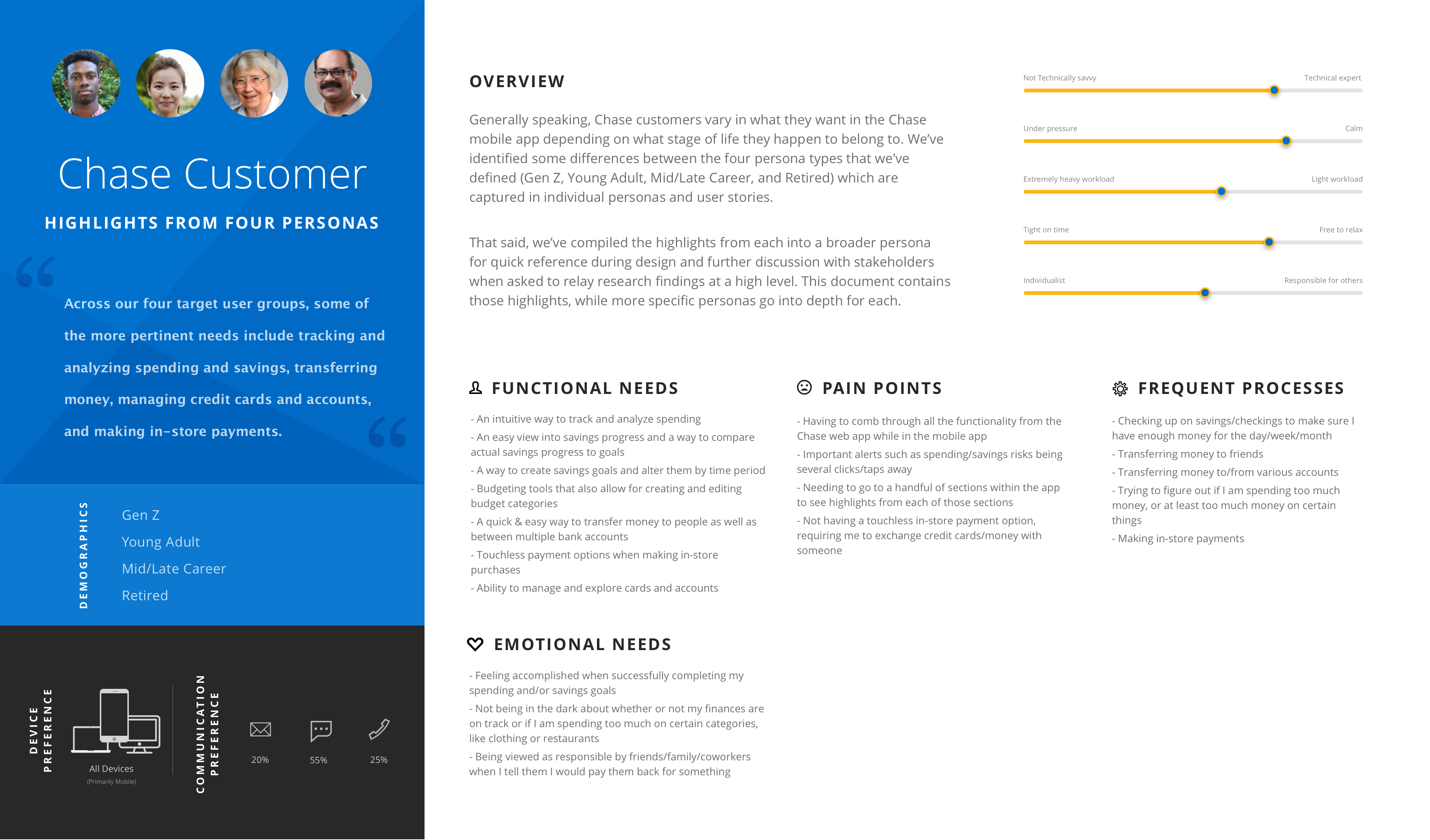
Personas
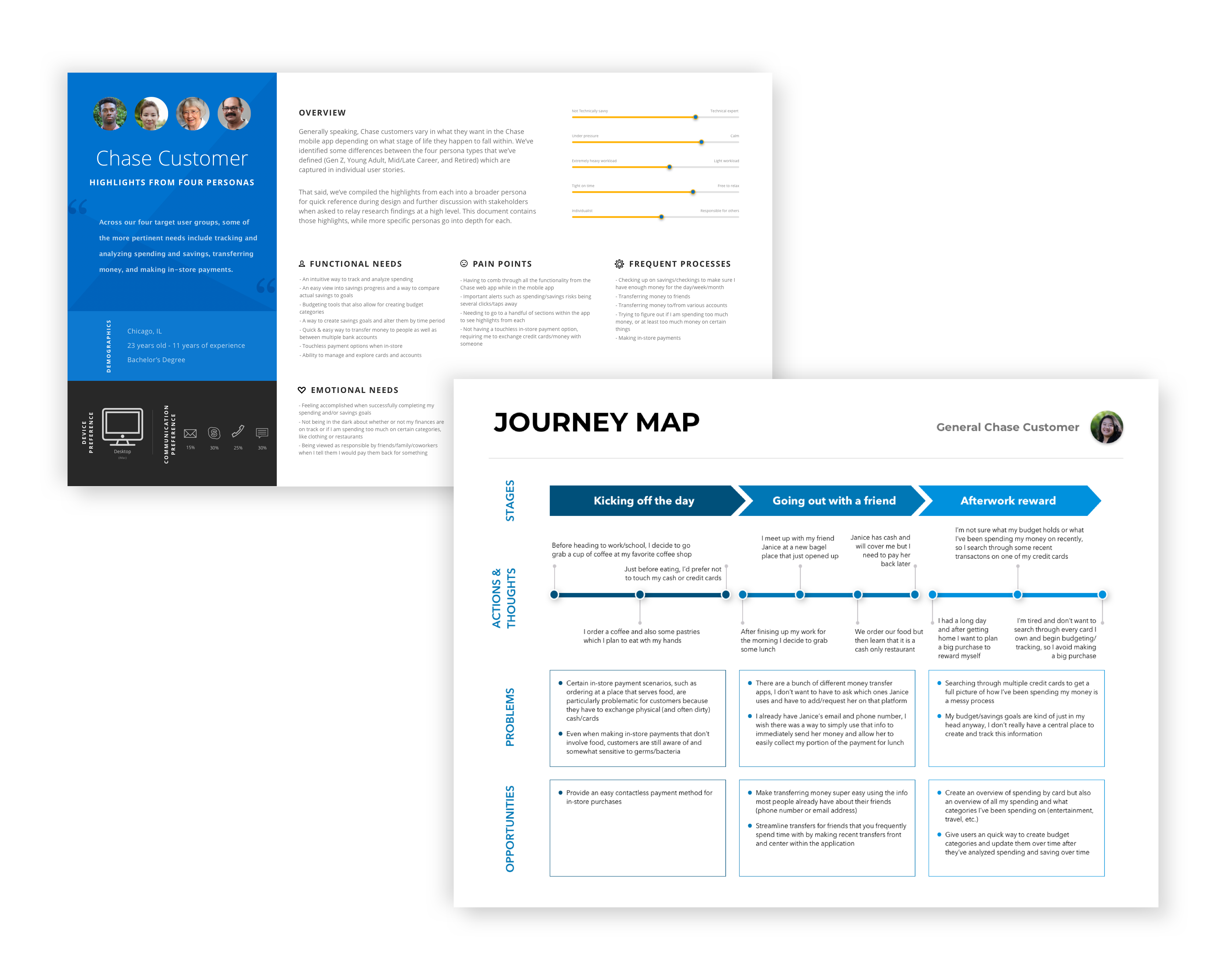
Coming out of the empathy phase, we took our insights and began creating research artifacts to summarize our findings. One type of these artifacts was the persona.
We developed 4 personas to design for: millennials, young adults, people mid-late career, and folks of retirement age.
In addition to creating a persona for each, we also created user stories that called out very specific needs to design for.
For the sake of concision, here is a combined persona that represents the highlights at a high level, as well as a few examples of user stories we created specific to each user segment.
Combined Chase Customer Persona
Persona Specific User Stories
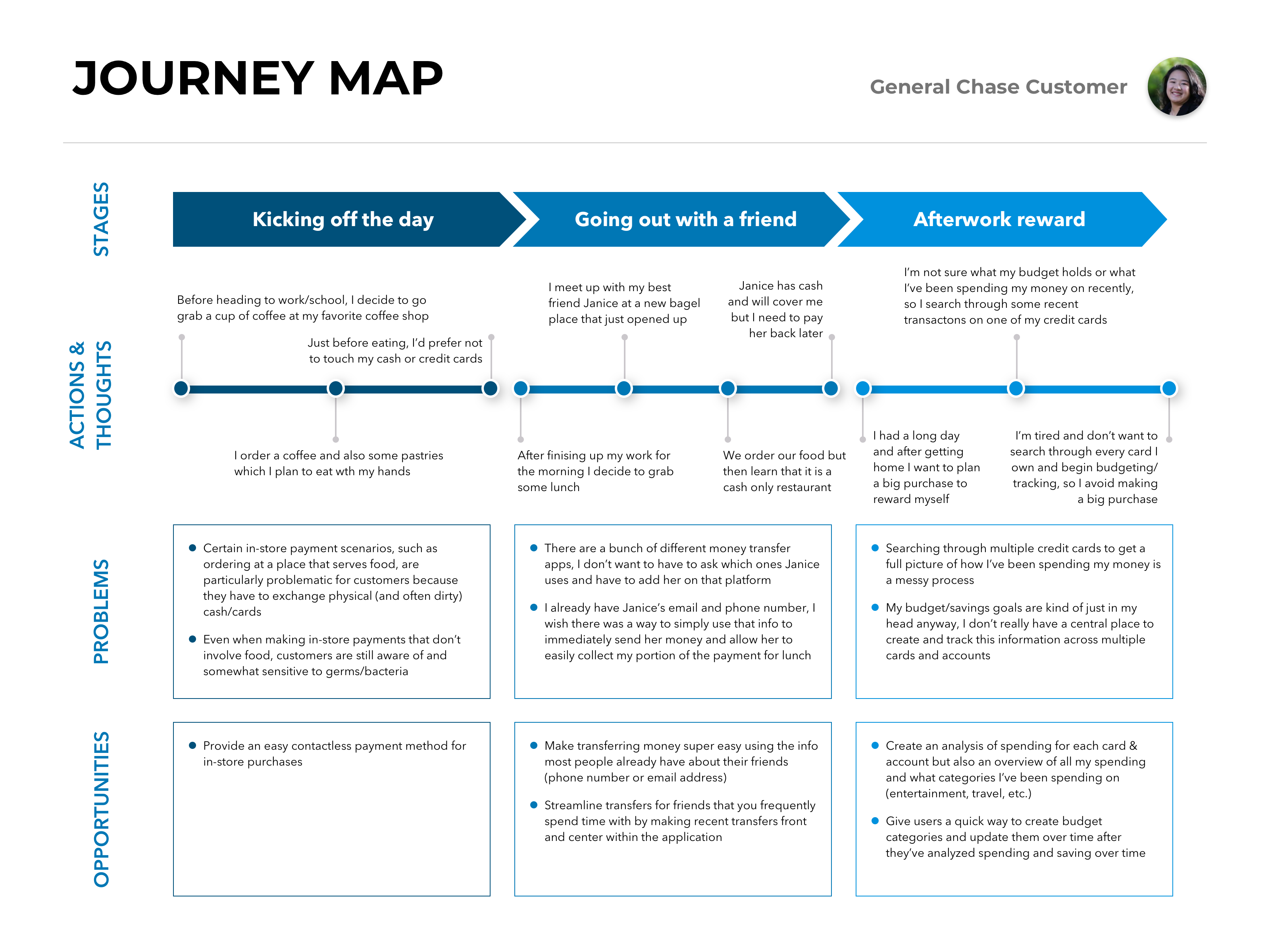
Journeymap
Based on the insights we gathered through talking to and observing users, we mapped out how a typical user would interact with our app in various everyday contexts.
This journeymap summarizes the contexts and use cases that we heard users asking for and describes the future state functionality that we designed to meet those needs.
Red Route
Beyond the qualitative research we performed to create personas and journeymaps, we supplemented these insights by analyzing usage data for the current state Chase mobile apps which listed the most/least used features within their current state experience.
Combining what we heard from qualitative research with the data we captured on current state usage, we created a red route to show where our design priorities should be based on the features of the app that are most desirable to users.
Long story short, the culmination of our qualitative user research and quantitative look at current state usage led us to target 4 primary design opportunities:
Design Opportunity 01.
Track & Analyze
Tools for tracking and analyzing spending and saving activity
Design Opportunity 02.
Transfer
An easy way to transfer money to people as well as banks
Design Opportunity 03.
Manage
Account management, be it for cards or checking/savings accounts
Design Opportunity 04.
Contactless Payment
A quick and easy way to make contactless payments in-store
04
Lo-Fi Ideation
How I translate user insights into initial ideas that can be iteratively refined and eventually shortlisted and prioritized
Intro
In this section, I’ll walk you through how I begin the ideation process and eventually, after some iterative refinement, how I prioritize feature development and define a hierarchy within a sitemap based on user value as well as feasibility/cost.
Low-fi Ideation
Having established a solid foundation of user insights, we took our learnings and began to ideate. When I initially begin ideation, I like to start low-fidelity, generate a lot of ideas, and temporarily kick feasibility to the side.
I find that it is necessary to begin the design process by shooting for the sky first and later on refining ideas based on business and engineering considerations.
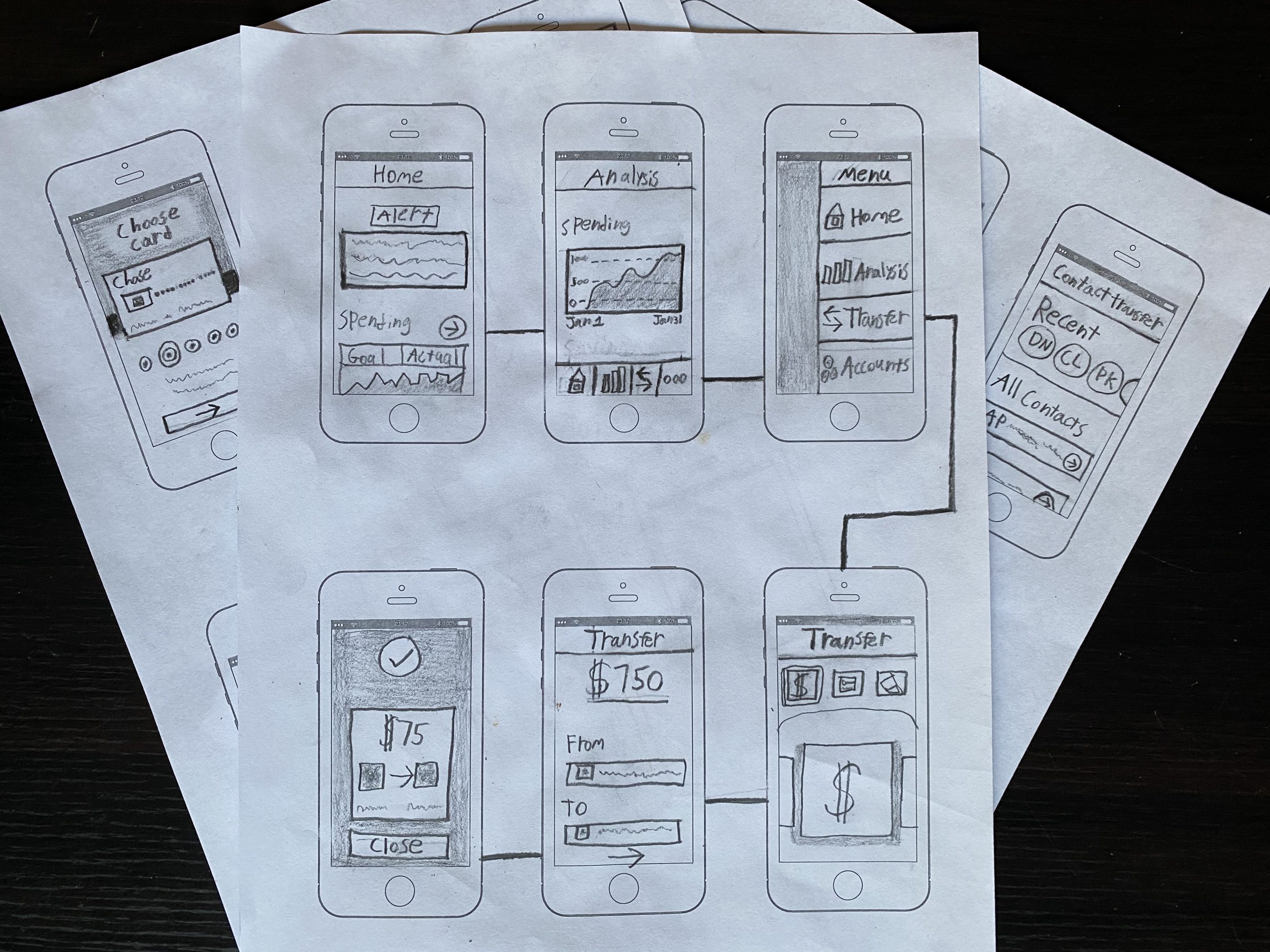
Here’s an example of some sketching I did to quickly begin visualizing how initial ideas might fit into the app. This included first-pass thoughts on how to visualize things like alerts, spending/savings analysis, transferring money to friends and/or other accounts, etc.
This allowed us to quickly put a lot of ideas in a form that could be further discussed later on with users and internal stakeholders with the goal of continued refinement.
The main goal here was to 10x. That is to say, rapidly generate a lot of ideas that we could play with.
Wireframes & Iterative Refinement
We took our best initial sketch ideas to the next level through wireframing and gathering feedback.
Further focusing on refining this shortlist through wireframing allowed us to improve ideas at a more presentable and testable fidelity — yet it remained low-fi enough as to not slow us down while ideas were still somewhat malleable.
Wireframe
Final Design Choices
One example of this was how we iterated on the home screen to uncover ways to increase feature discovery beyond top-level navigation items.
Early on, we wireframed the home screen without any navigation buttons in the body of the screen. The reason for this was because we felt we had reduced the overall sitemap in a way that the app should feel fairly contained and discoverable (a large problem we were solving for in Chase’s current mobile experience).
While I do think we achieved this goal of “trimming the fat”, we discovered during testing our prototype with users that there were still a few things that people were asking for right off the bat.
For example, we had about 15% of users ask where they could go for reporting a lost/stolen card and requesting a replacement. We also had about 20% of users asking where they could find Store Payment.
Information architecture is always a tricky thing on mobile. You should really only have 3-5 primary navigation icons (3-4 if you include a “more” button for an additional navigation menu), so you always want to make sure that the features within your app that are the most important end up getting slotted in this limited space.
Having done that by identifying that “Home”, “Analysis”, “Transfer”, and “Accounts” would be the most used features within the app, there was still a question of how to increase user discovery of the features that would rank 5th and beyond in terms of usage/popularity.
We decided that we could account for this user insight of wanting to discover a few additional features of the app that fell outside of the top 4 — we did this by having an “Explore” section near the top of the home screen. This allowed users to quickly discover and access additional features of the app that fell outside the top-level navigation.
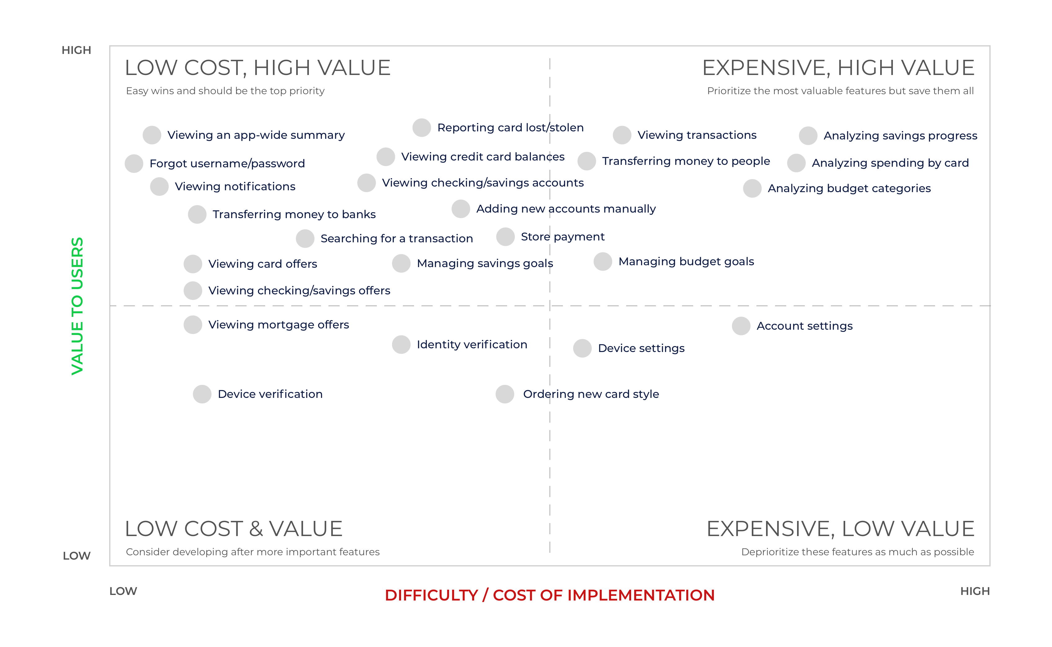
Feature Prioritization Matrix
In addition to prioritizing features based on value to users, we also factored in feasibility and development effort. To do this, we pulled in developers to assess implementation effort for each feature.
Once we had gotten a sense for cost and value, we then added that feature to our Cost/Value matrix to help prioritize the backlog. Doing this helped UX coordinate with the project manager and align on roadmap items to tackle. It also allowed us to understand which features we had more time to explore, prototype, test, and refine.
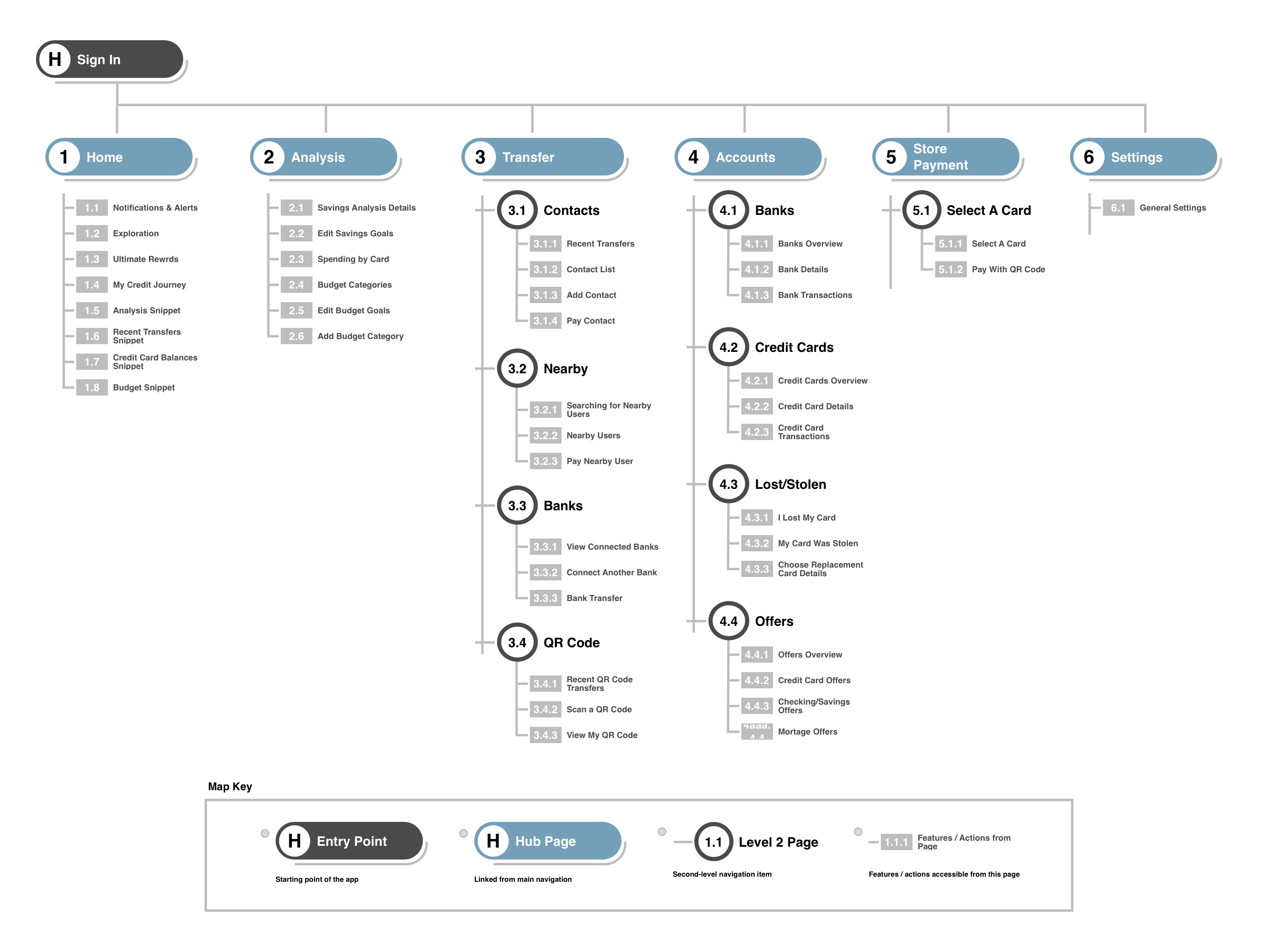
Sitemap
After getting a better understanding of which features we wanted to pursue, we then created a rough information architecture to help visually organize what we thought should be the main facets of the new app experience and how they might be structured relative to each other.
We refined this information architecture as we continued prototyping, testing, and learning more about what was most important to users (and therefore should be most easily accessible). We eventually ended up with this sitemap.
05
Final Design Choices
Three examples of fine-tuning the experience to be aligned with context of use and mental models
Intro
In this section I’ll talk about a few examples of fine-tuning interaction design by prototyping and testing several approaches to solve user needs and what drove our final design decisions.
Example #1: Interaction Design for Selecting a Bank
The Pros & Cons of Contrasting Interaction Design Approaches
When selecting a bank, we considered two methods of interaction.
One method (Version A) was to try to make all bank accounts visible and selectable at a glance.
Pros:
- Selection efficiency (if all banks are equally likely to be selected)
Cons:
- More visual stimuli and a potential feeling of clutter
Another interaction method (Version B) was to enlarge each bank selection element and create a horizontally scrollable list, reducing both visual clutter as well as the chance of selecting the wrong element (mis-tapping), both of which are important considerations in the context of mobile design.
Pros:
- Selection Efficiency (if one or two banks are likely to be selected the vast majority of the time)
- Selection accuracy (larger target and inability to select an “out-of-range” element in the list)
- Less visual stimuli/clutter and a cleaner look & feel
Cons:
- Selection efficiency (if users use many bank accounts equally)
Version A
Version B
In addition to weighing the pros and cons of each based on our own personal knowledge of interaction design, we tested each prototype with actual users to gather additional insight into how users think about and interact with their banks.
What we found was that people might have many open accounts for various reasons (sign up bonuses, varying interest rates, free ATM withdrawals, etc.), but in actuality they really only use one account 95% of the time.
With that said, the second interaction design method really started to stand out.
After considering the pros and cons of each design, we ended up going with the second interaction method (Version B).
Not only was it more mobile friendly and visually pleasing, it was more in line with the actual usage patterns of target users, making it easier to select your most used bank account, as it would appear first in the horizontally scrollable list.
Example #2: Cards & Accounts
Solving The Disparity Between The Mental Model of Customers & Banks
Mental Model Disparity Between Banks & Customers
Banks Screen
Credit Cards Screen
Commonly, banks use the word “accounts” to encompass both credit card accounts and various storage accounts (checking, savings, etc.)
However, as we were observing customers using various competitor apps, an important insight was that they actually described and thought of credit cards as distinct from their checking/savings accounts.
The missed opportunity that we were seeing for a lot of competitor apps (and also the current state of the Chase web/mobile app) was that they were creating an information architecture and visual experience that lumped together these two concepts, creating a false equivalency.
Learning that users actually view these two things as related but distinct, we decided to design the new Chase app in a way that put these two concepts near each other, yet had clear separations.
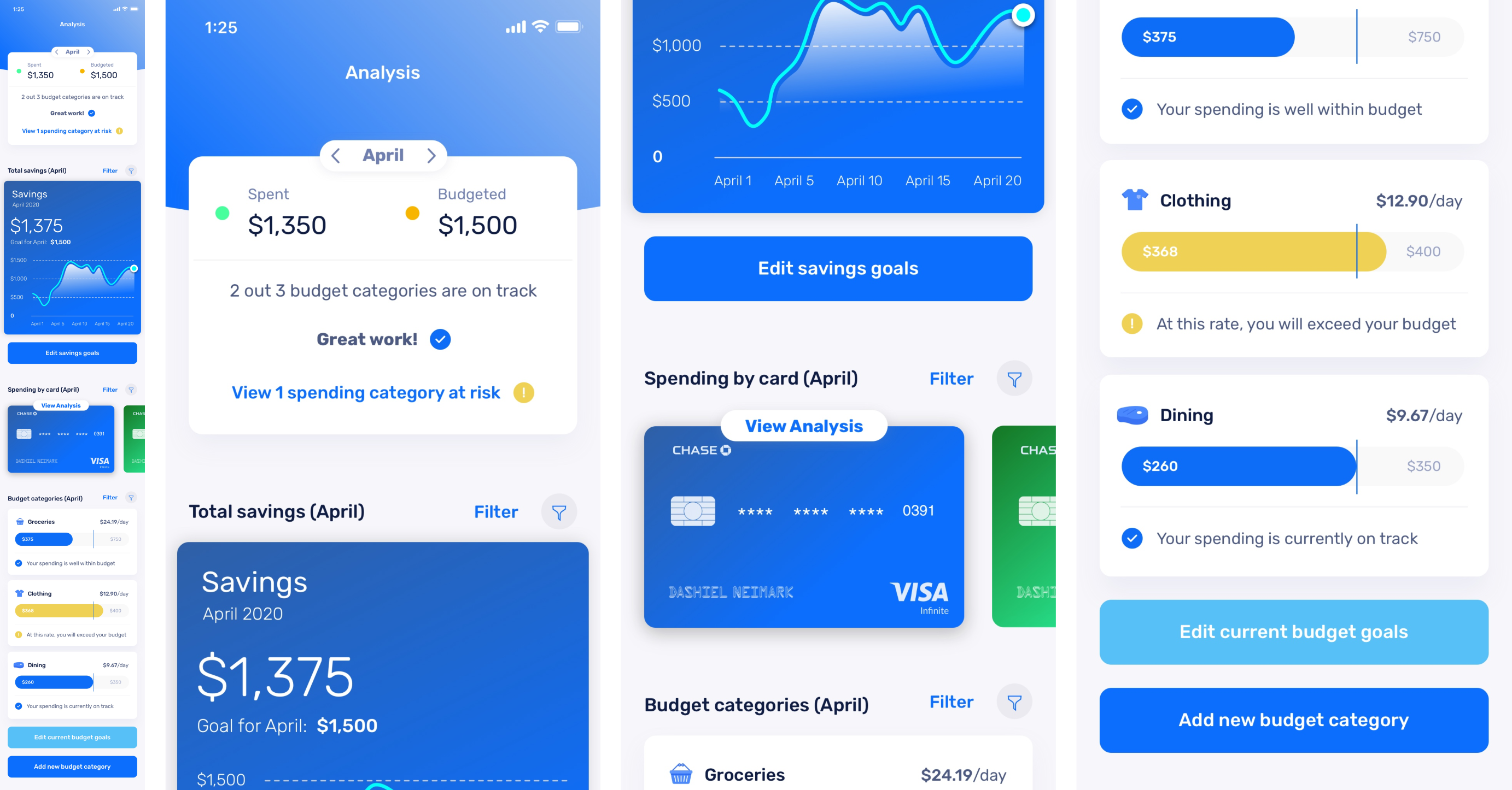
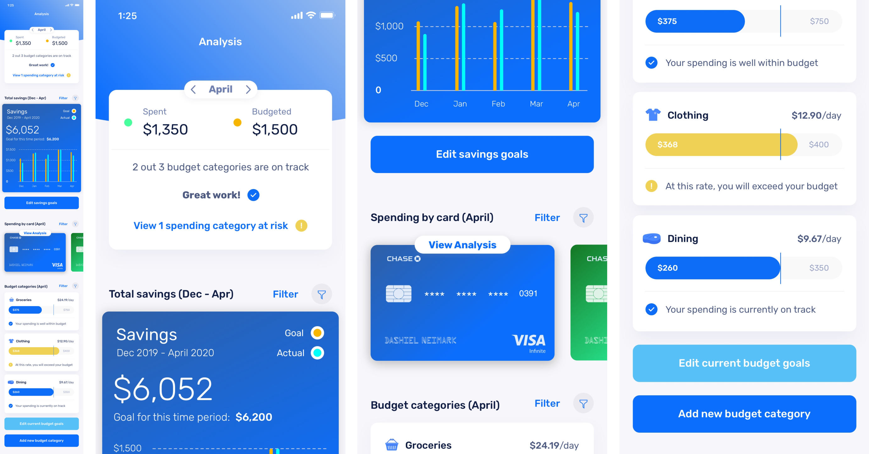
Example #3: Displaying Data Appropriately for Context of Use
Creating Multiple Ways of Analyzing Savings Goals
First Use Case (Glancing)
Second Use Case (Precise Analysis)
As I was testing initial prototypes to enable customers to analyze their progress towards savings goals, I gained consensus on what type of data visualization customers were actually interested in depending on the context of the time period they were analyzing (exact measurements vs. rough estimates).
I learned two important things:
- When analyzing a smaller time period such as a month, customers wanted to see a general trend and have a quick glance at a graph to judge their progress towards savings goals that occurred within that month.
- However, when comparing larger time periods (one month to another month, or one year to another year), customers still wanted to see how each month finished and if they met their savings goal for each of those months. A line graph was not the right design choice for this.
Using a line graph across a chart that represents something like 6 months would make it difficult to see where each month ended exactly, so I designed a comparative bar chart visualization so that many distinct time periods within a singular chart could be clearly separated and identified.
With these insights in mind, I created different data visualizations to represent each of these customer needs.
For the first use case where customers are analyzing a smaller time period such as a single month, I created a line graph. This helped give a quick glance at how they were doing, without introducing the cognitive load of comparing exact measurements for each and every day within the month.
For the second use case where customers are viewing larger time periods (“How was my spending in the last 6 months? Last year? Last couple of years?”) and came into the experience with more of a “reflect and analyze” mindset, we created a comparative bar chart so that customers could still analyze more exact measurements for multiple segments in time.
06
Project Reflections
Navigating Stakeholder Sensitivities & Exploring Distinct Experiences Across Web & Mobile
Navigating Stakeholder Sensitivities & Exploring Distinct Experiences Across Web & Mobile
Naturally, people can have a tendency to defend their initial assumptions or ideas. I think this is something that almost everyone has experienced, no matter how disciplined we may think we are at being able to put our own beliefs aside and consider an opposing view.
In this project, we were asked to imagine an entirely new experience with the potential to then build the Chase mobile app from scratch.
One specific example where this could have become potentially problematic was in how we decided to go about ideating for this new experience.
A large part of our process in coming up with new ideas was to first evaluate the current state. We did some think-aloud contextual observations, interviewed some folks, and ended up finding that much of the current state Chase mobile experience felt unnecessary to users. It felt bloated. They wanted a slimmer app with a greater focus on the handful of features they truly cared about.
The difficulty was that the Chase team that created the existing mobile experience had a natural inclination towards making sure the mobile app “had everything the user would need”. This is a sentiment I can agree with generally, but the disconnect we had was that the way they measured “everything the user would need” was based on analyzing desktop usage.
So, they simply wanted to carry over all desktop Chase features and content to the mobile experience. I was hesitant that this was the right approach and what I found was that actual users were too.
Presenting this finding to internal Chase stakeholders had to be done carefully. Particularly as I was somewhat of an “outsider” being a consultant/contractor for them.
I did this by focusing on three things:
- When we met with Chase stakeholders to review our initial findings and ideas to solve the problems that users were mentioning, I made sure to start first with positive findings. I find that this helps set the stage for a more receptive and collaborative conversation.
- When it came to the negative findings, I knew I had to make sure it wasn’t “personal”. That is to say, it wasn’t just my opinion vs. their opinion. It was the opinion of their customers.
- I framed these design review conversations that I had with Chase stakeholders in the context of our overarching KPIs and goals for the project. By continually referencing these and relating design decisions back to our shared set of goals, it was easier for everyone to get on the same page.
The result was positive in that they were fairly receptive to both our findings and proposed ideas to begin prototyping and testing. Earlier in my career, I might not have navigated these sensitive conversations as well. After encountering them a few times by now though, I was able to keep the conversation collaborative by having empathy for the good work that had already been done by the Chase team so far and always making team discussions user-centric.