Nike Discovered
Creating a digital experience that could creatively increase value-driven, targeted brand representation at scale by allowing Nike Brand Managers to discover new talent in the amateur athlete world.

User Empathy
Interviewed and observed Nike Brand Managers and Amateur Athletes to better understand our target users

Synthesis & Ideation
Reflected on learnings through group de-briefs, affinity diagramming and the creation of personas and journeymaps

Experience Design
Concepted, tested and refined design solutions to identified needs through sketching, wireframing, and prototyping

Visual Design
After validating ideas with internal and external stakeholders, I created hi-fidelity mockups and dev-ready documentation
Table of Contents
01
Project Intro
What we created, project overview, timeline, team structure, my responsibilities, project outcome, KPIs, & design process
What We Worked On
We researched, designed, and developed a digital network connecting Nike Brand Managers with non-professional athletes for sponsorship opportunities.
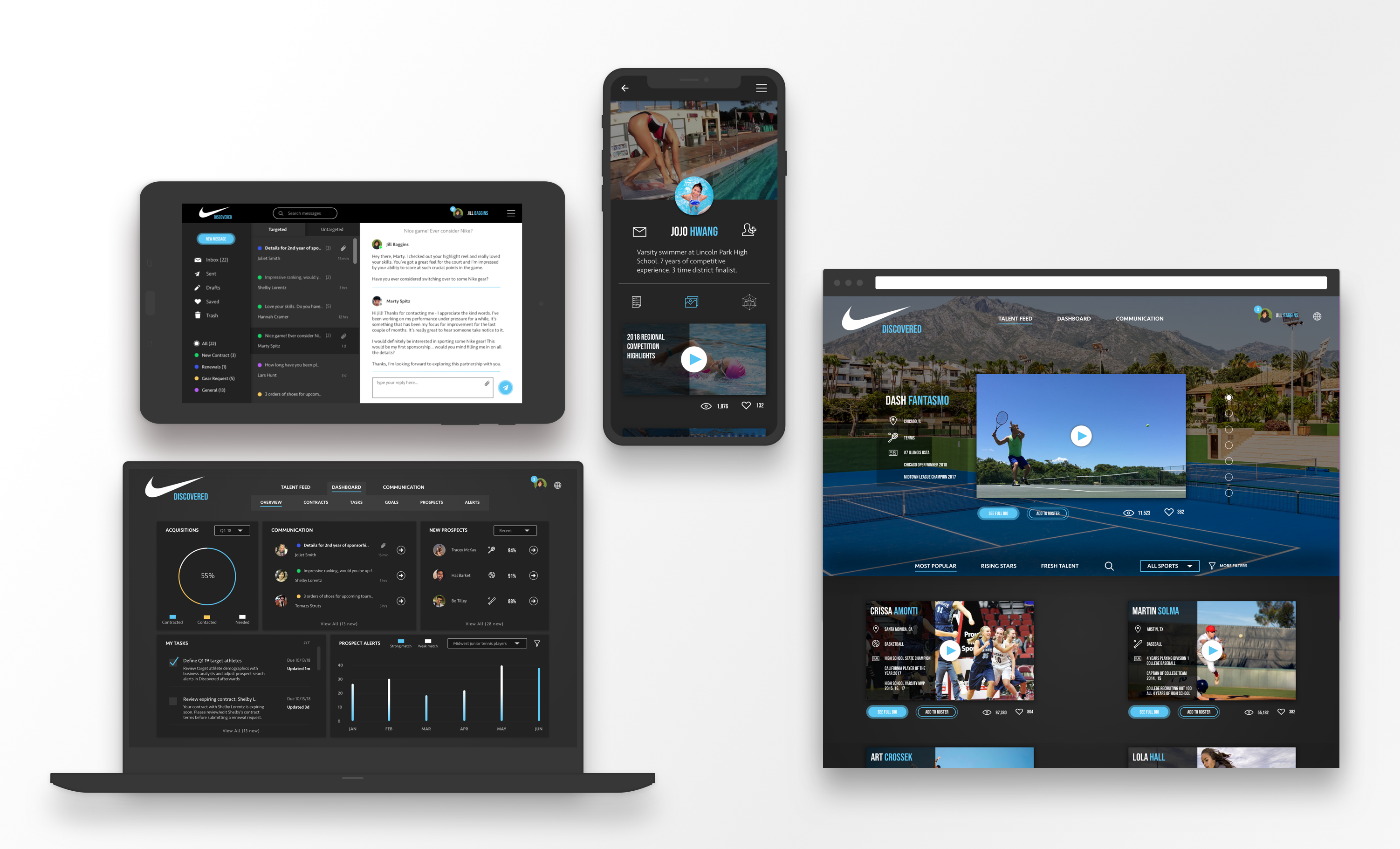
From the Brand Manager side (our first focus), the app we created, Nike Discovered, enabled Nike Brand Managers to search for, save, communicate with, contract and manage athletes.
Deliverable Overview
Over the course of this project, some of the deliverables I created include sketches/wireframes, hi-fidelity mock-ups, interactive prototypes, UI animations, user flows, a pattern library and style guide, personas, journeymaps, a red route and a sitemap.
Throughout this case study, I’ll explain how these outputs were developed and what role they played in the overall product design process for Nike.
Project Logistics
Nike asked us to explore how we could creatively increase value-driven, demographically targeted brand representation at scale. After chatting with several brand managers and business stakeholders in early stage discovery interviews, we learned that there is a major opportunity to increase the impact of dollars spent on brand representation by sponsoring athletes in a much more targeted and scaleable way: Targeting non-professional athletes.
This ultimately meant that we had to design a way to make targeted non-professional athlete discovery possible. At a high level, this entailed designing tools that allowed brand managers to search for athletes based on geography/demographics/sport played, save and communicate with those athletes, manage contracts and athlete relationships, and more.
This project was completed over 9 months. This included discovery and the implementation of the Nike brand manager portal.
Over the course of this project, I collaborated with internal stakeholders, including developers, business analysts, a UX researcher, and one other UX designer. I also actively and frequently engaged target users such as Nike brand managers and a diverse set of non-professional athletes.
My responsibilities throughout this engagement were to lead the UX activities, both in terms of research and design. This included selecting and implementing research methods (interviews, observations), synthesizing the findings (affinity diagramming), early stage ideation (sketches, blockframing, wireframing, prototyping), testing and gathering feedback (prototype testing, A/B tests), and ultimately producing the final hi-fidelity designs with development-ready documentation.
Just as importantly, I also worked alongside business stakeholders at Nike to define KPIs and have collaborative design sessions where we would make sure that our design ideas accommodated not only user needs, but business needs as well.
After initial discovery, I worked alongside the development team (working 2 sprints ahead) through the implementation of Nike brand manager portal.
We concepted and aligned on a viable direction for accomplishing Nike’s goal of increasing value-driven, targeted brand representation at scale.
We worked with Nike through the discovery, design, and implementation of the brand manager application (the focus of this case study). The athlete portal has not yet been implemented but is being continually refined and considered for future launch by Nike.
Tying Design to Business Impact
Defining KPIs
In order to make sure that the experience we designed actually had a positive impact on Nike’s bottom line, we defined KPIs to be measured.
Although we designed and developed the Nike brand manager application, KPIs are waiting to be measured until the application for non-professional athletes has been complete, as they are dependent on being able to find, select, contract, and maintain athletes.
Process Overview
Low-fi, Iterative Ideation
Quickly and iteratively created ideas, put them to the test, gathered feedback, and refined until concepts were validated and ready for the visual layer.
Hi-fi Mockups & Prototypes
As low-fidelity concepts moved closer to validation, I created hi-fidelity mockups and prototypes and continued gathering feedback at a more detailed level, eventually working with development through implementation.
Style Guide, Pattern Library, & Development
Created dev-ready documentation via styles guides, a pattern library, and UI animations via Principle to fully demonstrate to the team all intended interactions and their subtleties.
02
Empathy
Problem statements, empathy methods, personas, journeymaps, actionable takeaways, & initial ideas
Intro
My process always starts with empathy. By better understanding our target users and mapping out their processes, pain-points, and future state desires, I’m able to focus my design efforts in a more effective way.
Here are problem statements that we defined for our two primary users (Nike Brand Managers and Non-professional Athletes) which serve as a concise summary of key problems we uncovered while using interviews, observations, and affinity diagrams to uncover and synthesize user insights.
This served as the basis for our initial design ideas.
Problem Statements

Problem Statement #1: Nike Brand Managers
Nike brand managers do not currently have a way to discover, filter, communicate with, sponsor, & actively manage non-professional athletes.

Problem Statement #2: Non-professional Athletes
Non-professional athletes have trouble getting sponsored because they don’t have an effective way to market themselves to brand managers and become discovered.
What We Set Out to Learn
Getting more into the process of how we arrived at the problem statements above, we took a look at four main categories of questions while empathizing with users through interviews and contextual observations:
Frequent Processes
What processes do users have regarding seeking sponsorship (athletes) / seeking to sponsor (brand managers)?
Pain-points
What pain-points do users encounter in their current state tasks and why?
Functional Needs
What goals do users have and what tools do they desire to accomplish those goals?
Emotional Needs
What are our users’ motivations and what sort of emotional needs drive those motivations?
How We Set Out to Learn
To gather insights on our target users for the categories above, we performed interviews and contextual observations, then synthesized our learnings using affinity diagramming
Interviews
I interviewed both brand managers and non-professional athletes. With all the topics I touched on, the goal of my interviews was to elicit perception-level insights and uncover the “why” behind the “what”.
With brand managers, I tried to find out why they take certain steps, like how they define sponsorship goals, who they interact with throughout that process, and the tools that they currently use to seek out, communicate with, and contract athletes. What were their motivations and end goals?
On the athlete side, I wanted to know how non-professional athletes viewed sponsorship and cash rewards for brand representation, how they perceived marketing themselves and what methods of self-marketing felt appropriate, as well as any current processes (if any) that they take to seek out sponsorship.
Observations
While interviews are helpful in supplementing observations, people often say one thing and do another. When performing my user observations, this was my chance to get more objective insight as to the “what” behind the “why”.
For example, I observed brand managers using a wide array of various tools and processes to accomplish their goals. To define and track athlete acquisition goals for the quarter they used things like Excel and Word that lacked transparency and shareability. Searching for and filtering through athletes required visiting countless websites, most with different methods of interaction. Communicating with and managing contracts for athletes was very unorganized and relied on manual organization within Outlook and painful file storage and retrieval within Dropbox.
We were beginning to see a pattern of disparate tools/processes that lacked automation, standardization, and collaborative ability.
Affinity Diagrams
After compiling all our raw notes from both interviews and observations, I began to find themes in what I was seeing and hearing.
Picking out the insights from the raw notes, myself and the other UX resource placed each one on a sticky note and clustered similar findings into themes.
After a few iterations of this, I began to form a better picture of each user’s mental model within various contexts.
This exercise helped me transform raw, disparate learnings into more organized and actionable takeaways. Reflecting on the affinity diagram, I then created personas and journeymaps to reference back and continually update throughout future design efforts.
Interviews
Contextual Observations
Insight Themes
Personas
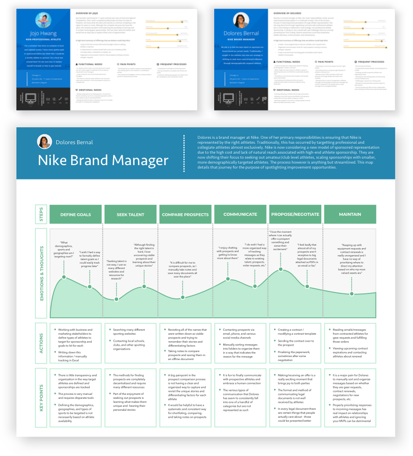
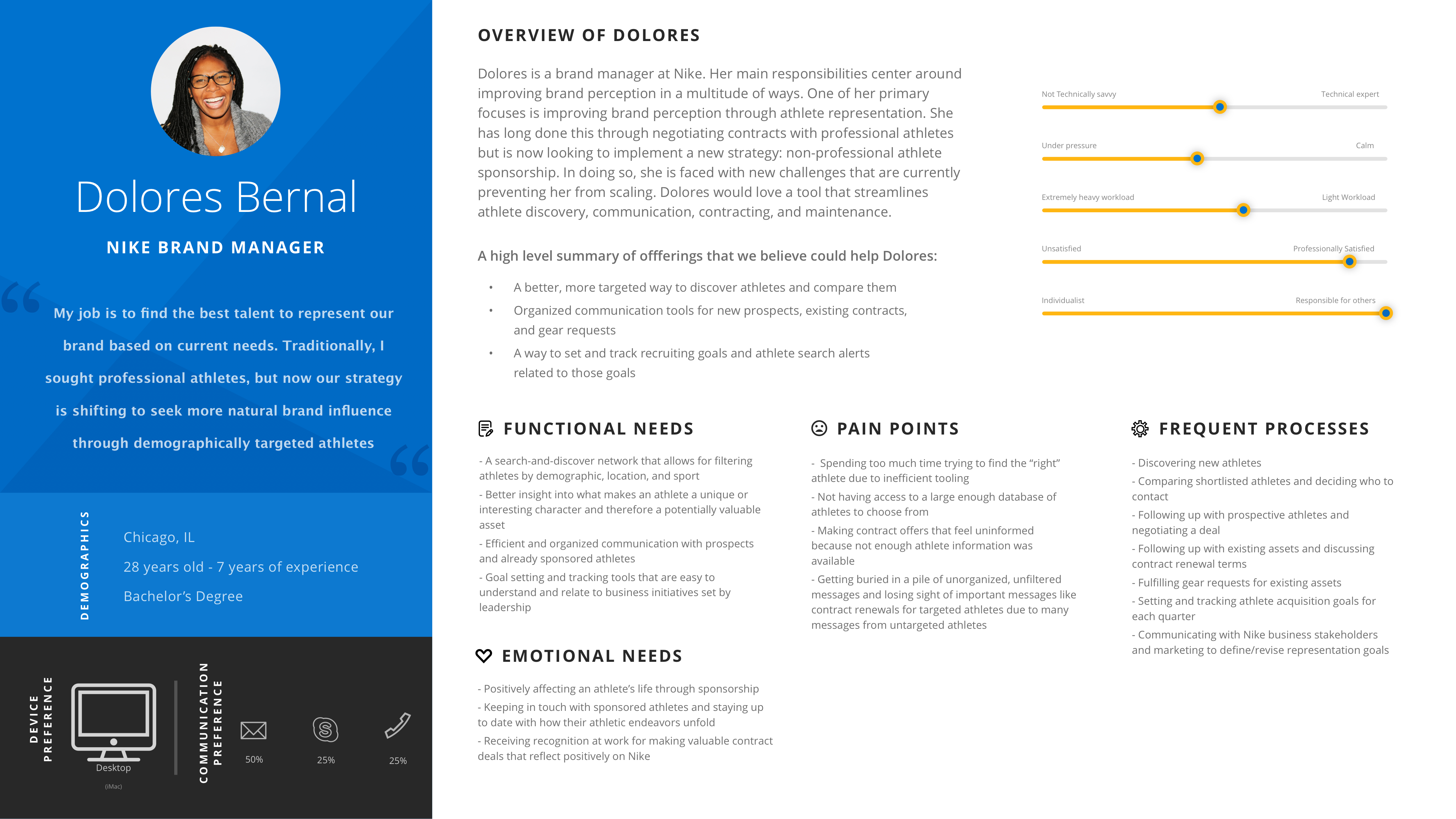
Coming out of the empathy phase, we took our insights and began creating research artifacts to summarize our findings. One of these artifacts was the persona.
I create personas as a living, evolving document to reference throughout design. That is to say, insights are not static. While I might create a persona after my initial user research, I continue to learn more about that user as I create, test, and gather feedback on potential solutions.
I believe that empathy is a continuous journey and the deliverables that represent insights should continue to evolve over the length of that journey.
Here are the two personas that I created. One for brand managers and one for non-professional athletes. The personas provide an overview of each audience type, including functional needs, emotional needs, current pain points, and frequent processes to refer back to during ideation.
Nike Brand Manager Persona
Design Opportunity 01.
Athlete Discovery
A better, more targeted way to discover athletes and compare them
Design Opportunity 02.
Enhanced Communication
Organized communication tools for new prospects, existing contracts, and gear requests
Design Opportunity 03.
Goal Tracking & Alerts
A way to set and track recruiting goals and athlete search alerts related to those goals
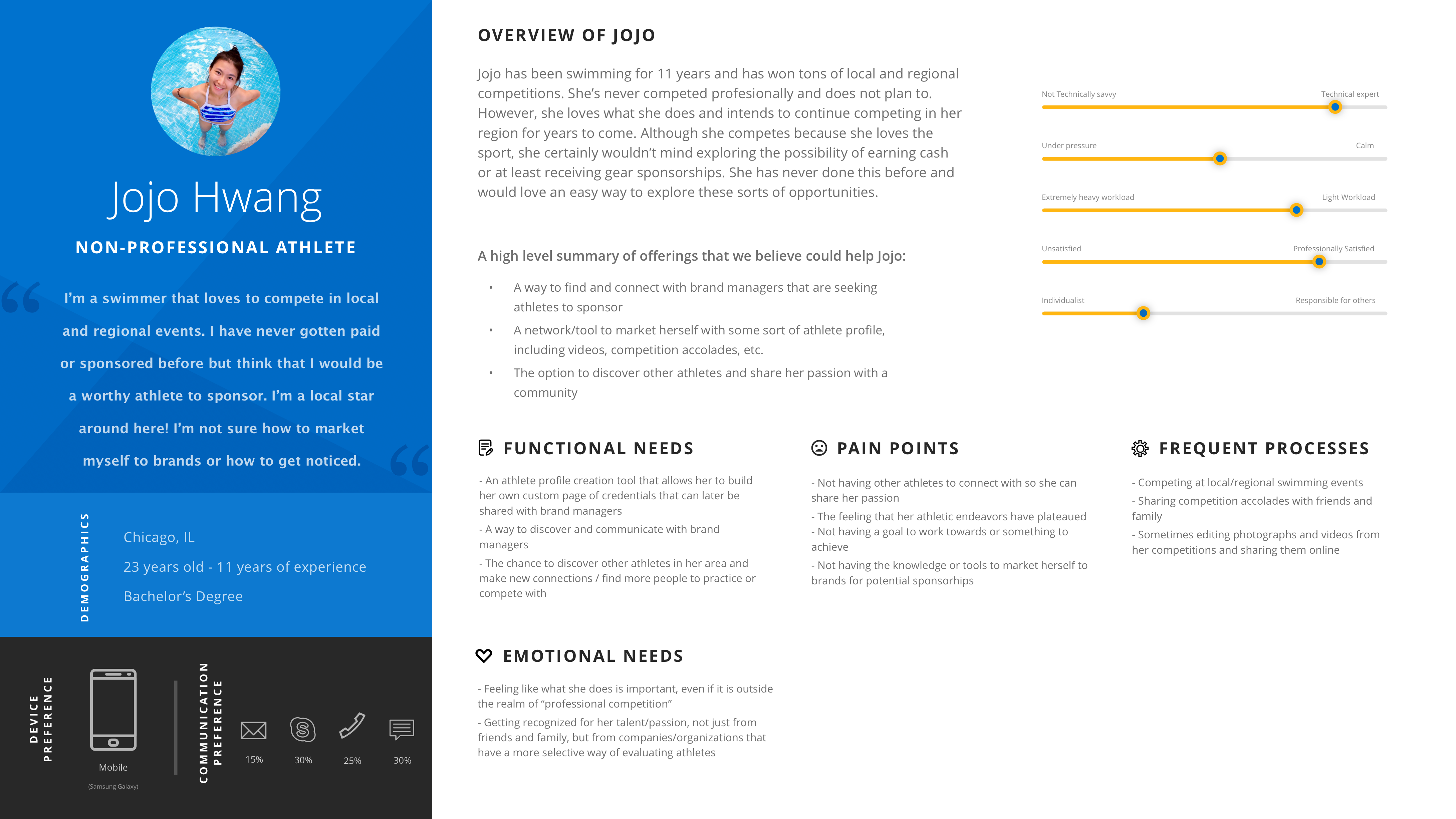
Non-Professional Athlete Persona
Design Opportunity 01.
Brand Manager Discovery
A way to find and connect with brand managers that are seeking athletes to sponsor
Design Opportunity 02.
Self-Promotion Tooling
Tools to market herself with some sort of athlete profile, including videos, competition accolades, etc.
Design Opportunity 03.
Athlete Networking
A network of other athletes to discover and share her passion with
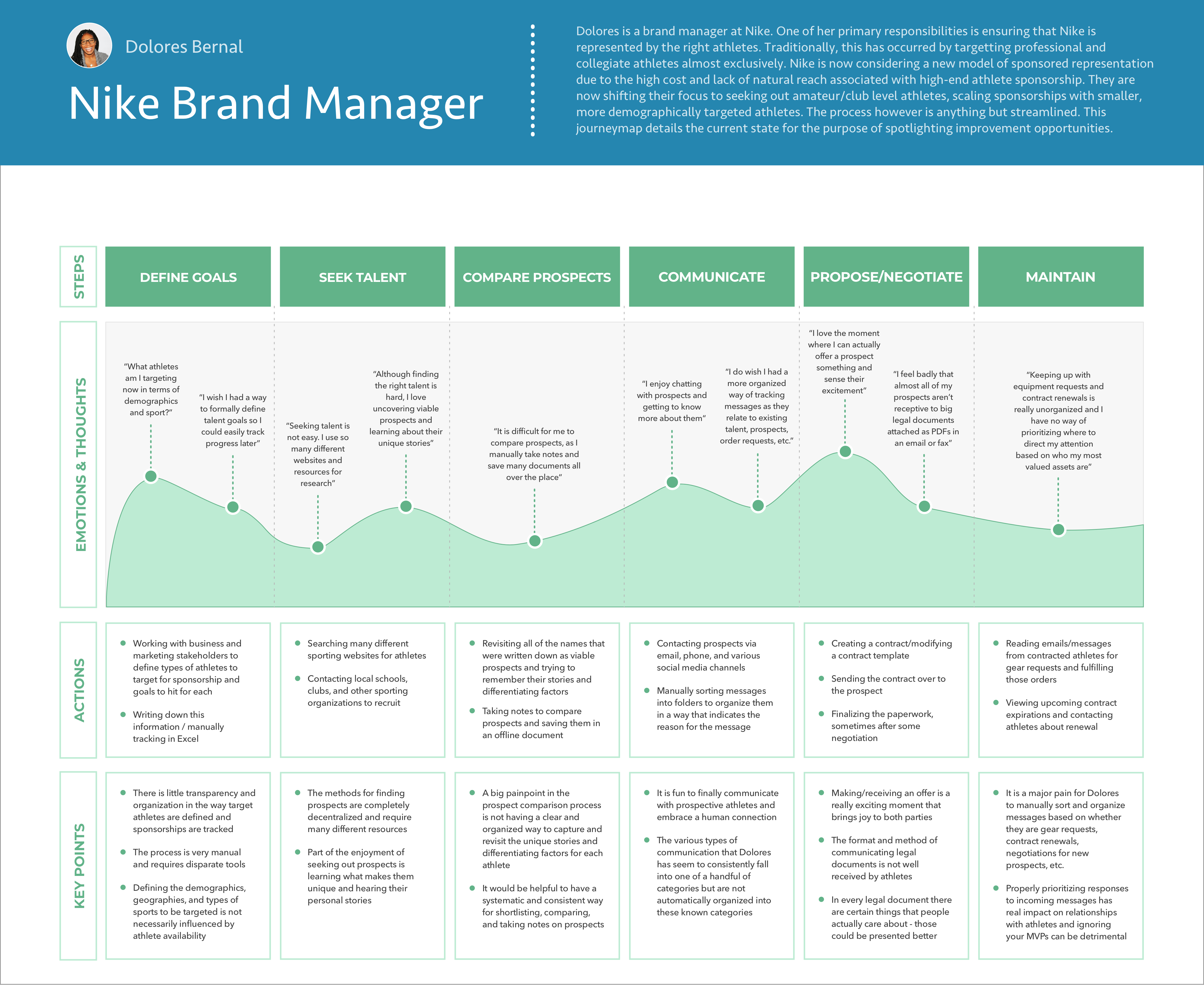
Nike Brand Manager Journeymap
Utilizing what I learned through interviews and observations (particularly the latter), I was able to map out the primary phases that each user goes through. For this presentation, I’ll focus on the Nike Brand Manager and what they go through in regard to athlete brand representation and the details involved with each phase.
This journey starts with defining goals for who they want to sponsor each quarter, seeking out people that match those goals, shortlisting and comparing potential athletes to acquire, communicating with those athletes, proposing a deal and possibly negotiating that deal, contracting the athlete, maintaining them throughout their contract, and eventually thinking about and preparing for contract renewals.
As I entered the design phase, it was extremely helpful for me to reference each of these steps in a brand manager’s journey so that I could make sure we were creating an experience that reflected an understanding of the user’s mental model.
Perhaps most importantly, the journeymap better enabled me to understand the actions taken during each step of the journey and the emotions and thoughts that those actions elicited so that I could see where there was opportunity to design a solution to improve the existing experience of a brand manager’s journey.
Key Takeaway 01.
Difficulty Defining & Organizing Recruiting Goals
There is little transparency and organization in the way target athletes are defined and sponsorships are tracked
Key Takeaway 02.
Decentralized & Inconsistent Tooling
Methods for finding prospects are completely decentralized and require many different resources
Key Takeaway 03.
Prioritization Difficulties & Manual Processes
Deciding how to prioritize her time is difficult due to manual process of sifting through tasks/messages
Actionable Takeaways & Initial Ideation
Empathizing with users can be both great and challenging for the same reason: lots of information begins to surface.
For that reason, I find that it is necessary to reflect on insight assets such as personas and journeymaps and summarize the most actionable information to prep for the design phase.
This not only helps me maintain a clear focus for what opportunities I am designing for, it is a great way to communicate key takeaways with other stakeholders such as developers, product owners, or business analysts who may not have the appetite for diving into an entire journeymap or set of personas.
Here are the 5 main actionable paths forward that I came up with based on key takeaways from the user empathy stage.
Design Opportunity 01.
Define Targets
An organized & informed way of defining what athlete demographics to target
Design Opportunity 02.
Set & Track Goals
A way to set and tracking recruiting goals with shared visibility amongst other Nike stakeholders
Design Opportunity 03.
Save & Compare Athletes
Tools for saving, organizing, & comparing shortlisted athletes
Design Opportunity 04.
Task Management
A checklist of things to do / follow up on
Design Opportunity 05.
Centralized & Prioritized Communication
A centralized method of communicating with athletes & sorting messages based on content / priority
03
Lo-Fi Ideation
How I translate user insights into initial ideas that can be iteratively refined and eventually shortlisted and prioritized
Intro
Having established a solid foundation of user insights, we took our learnings and began to ideate. When I initially begin ideation, I like to start low-fidelity, generate a lot of ideas, and temporarily kick feasibility to the side.
I find that it is necessary to begin the design process by shooting for the sky first and later on refining ideas based on business and engineering considerations.
In this section, I’ll walk you through some methods I use to begin the ideation process and eventually, after some iterative refinement, prioritize feature development and define a hierarchy within a sitemap.
10xing with Joint Application Design (JAD) Whiteboarding
Overview
Ideation Examples
Overview
Taking the foundation of knowledge I had built from the user research phase, I began to collaborate with potential users in coming up with some rough ideas to consider.
Although Joint Application Design sometimes comes with the disadvantage of introducing many varying opinions that may lead to difficulty in aligning on goals, it is a really great way to come up with a lot of ideas fast to later break down and prioritize.
Typically, when I first move from research to design and begin my very first round of ideation, I like to either sketch or whiteboard out my ideas so I can quickly visualize concepts, throw them away, and rethink them, all in a matter of minutes without investing too much time on any particular idea.
One fun activity that I tend to incorporate during this point of a project is called 10xing. Essentially, the idea is to come up with as many ideas as possible by bouncing thoughts off other people in the room and building off of each other’s concepts.
The trick is, you can never say no to an idea. During this exercise, you are not allowed to worry about feasibility, cost, usability, or any consideration that would typically be practical. Those considerations can be made later. The goal of 10xing is to generate a ton of ideas quickly and push each other’s ideas to the limit by adding to them with responses that always start with ‘yes, and…”
In doing this, we came up with a ton of really interesting ideas, some feasible, some not.
Ideation Examples
The first idea we came up with was an AI-powered athlete suggestion bot that showed which athletes a brand manager should pursue based on recruiting goals, target demographics defined, and the types of athletes the brand manager had previously favorited or contracted.
Another early stage idea from 10xing was a video chat feature where brand managers and athletes could communicate face-to-face.
We also thought of an idea that automatically sorted incoming messages based on the type of message it was, such as a gear request, contract renewal, etc. by intelligently reading the contents of the message and determining its purpose for you.
Although not all of these ideas made the cut, at least not in the initial way that way were described, they allowed us to generate some great ideas really quickly to later shortlist based on more practical factors like feasibility, business viability, and true user value.
Blockframing & User Flows
Overview
Example: Brand Manager (Primary User Flow)
Overview
Following up on the many ideas that were generated in the initial whiteboarding ideation session, we then started to bring some of these ideas back to down to reality.
I talked to developers to better understand technical feasibility concerns and also chatted with Nike business stakeholders to see which of these ideas best aided business goals or were simply “nice-to-have” items.
After some conceptual refinement with other stakeholders, I had developed a better sense of what ideas we might start to focus on. Once I reach this stage of confidence in a new product or new portion of a product, I like to move to blockframing and user flows.
Blockframing helps me revisit the ideation phase that was started while sketching and whiteboarding but in a digital format that allows me to create a click-through prototype to demonstrate user flows. Perhaps most importantly, it also allows me another chance to talk through high-level page specific features and how they fit into a process or group of processes.
I also like blockframes because they intentionally lack detail. They allow me to talk through page flow and page-level ideas but not to the extent where we are committing ourselves to specific details for these ideas on each page or spending time talking about hi-fidelity considerations like color, spacing, typography, and so on.
I spent a few rounds presenting and gathering feedback on the blockframes and, after some iterating, we reached a spot where we established some user flows to design for and felt confident moving to a higher level of design fidelity.
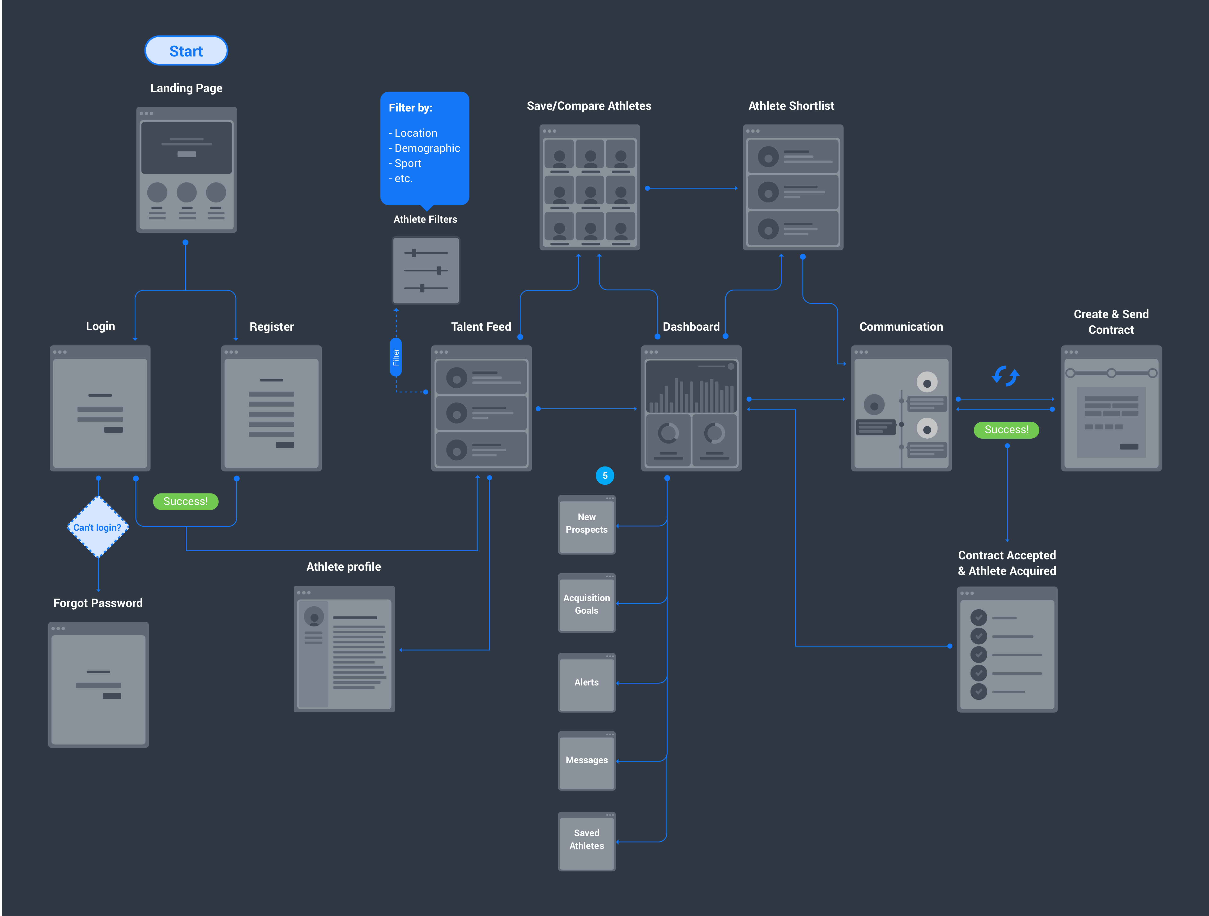
Example: Brand Manager (Primary User Flow)
Here is an example of one of the final user flows we landed on for brand managers and the blockframes that represented the general ideas it contained.
A Nike brand manager would hit the landing page and either log-in or sign-up. Successfully completing either task brings them to the athlete talent feed with the ability to filter based on location, demographic, sport, popularity, recency and so on.
In this feed they can also get a snippet of information on various athletes as well as view their highlight reel. The user could then save an athlete to later compare and contrast with other athletes or click into an athlete’s profile to see more.
Moving into more of the core tools within the application, brand managers could click into their personal dashboard where they would be able to get a heads up view into a variety of items.
This includes viewing new prospects that have come in based on their athlete search preferences, being able to see how they are tracking towards quarterly acquisition goals, seeing how their athlete alerts settings are performing and whether or not they should adjust what type of athletes they are looking for, checking on recent messages received, and revisiting saved athletes.
Having engaged in whatever tools were necessary for that given point in time, brand managers ultimately return to the flow of revisiting their shortlist of saved athletes and sending out messages to those athletes to build a relationship and discuss sponsorship.
After communicating with a few selected athletes for a bit, they eventually send them a contract, sometimes discussing and revising that contract before finally acquiring that athlete for a certain period of time.
Once an athlete is acquired, brand managers return to their dashboard to track their recruiting goals, check out new prospects, and adjust their athlete search alerts accordingly.
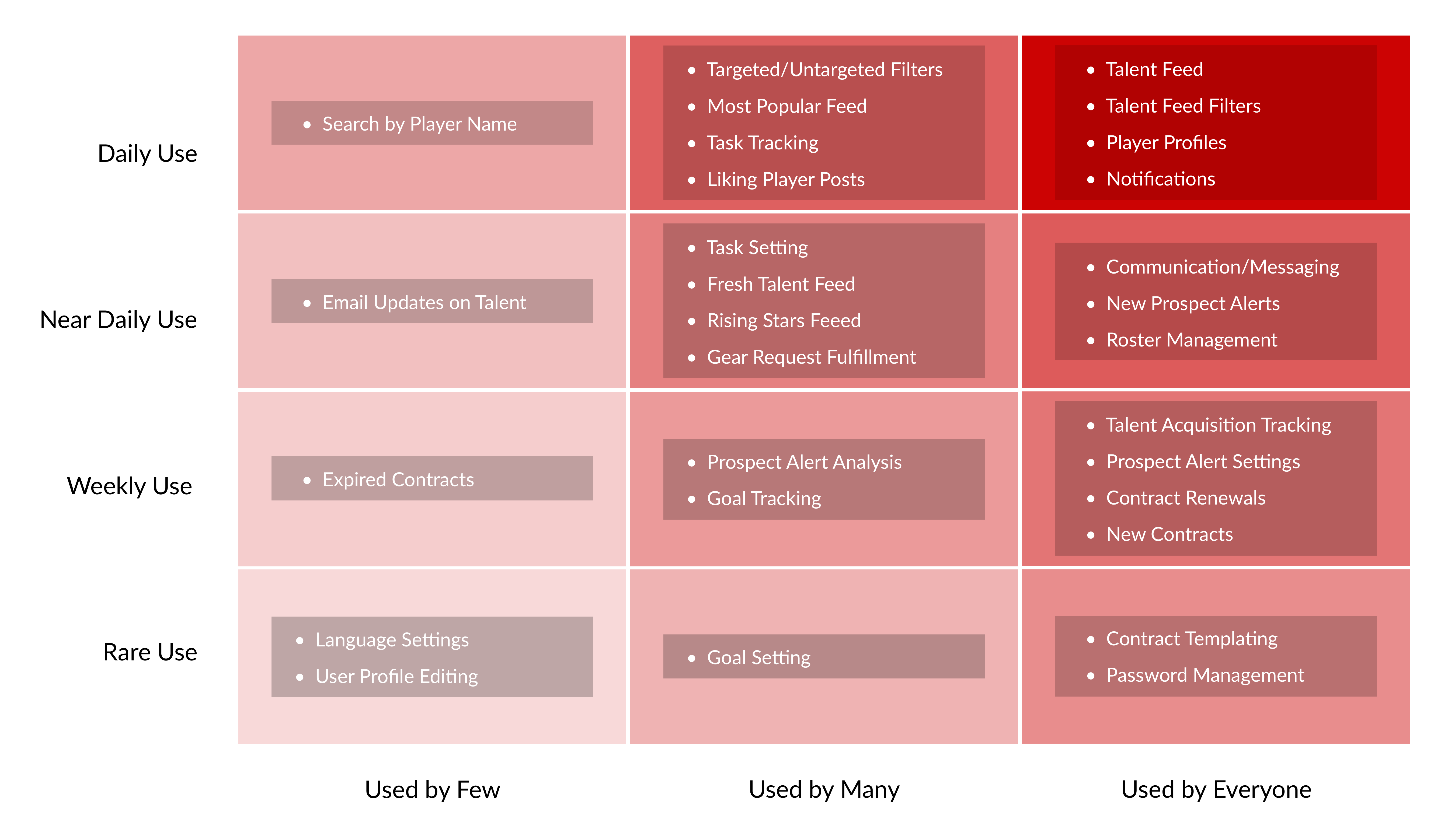
Prioritizing the Many Facets of The Experience With a Red Route
Overview
Actionable Implications & Continued Evolution
Overview
A red route allows us to visually organize contained segments of the experience by how frequently they are used as well as how widely they are used across users.
In this particular example, I will show the red route we created for brand managers.
When looking to finalize the way various features and pages would be represented in the application, it was important to understand how to prioritize certain user processes and actions within the overall experience.
The red route helped guide us throughout various prioritization decisions.
It helped inform more macro, information architecture related decisions such as where certain pages/content should exist within our multi-level navigation system.
It also helped guide us along more micro design decisions, such as how to craft the visual hierarchy of multiple, competing elements within a page.
As a bonus, red routes helped us summarize key points from user research in a way that could easily be shared with other stakeholders within the organization to help explain and justify design decisions.
We created this red route by testing our prototype and asking people to qualitatively describe their perceived usage of each portion of the app.
We also sent out a survey to a majority of Nike brand managers to help further quantify frequency of use. They were asked to assign a level of perceived frequency (1-10) for the usage of each of the below features/pages.
Knowing that perceived frequency of use is not necessarily 100% accurate, we merely used this as a baseline for determining how to prioritize the pages and features in our app, with the idea that we would later follow-up and test actual usage once the system had been implemented.
Actionable Implications & Continued Evolution
Being able to reference the Red Route throughout the design process — as well as evolve its content when feedback elicits new insights — helps continually guide design and content decisions.
Without going over all the design implications here, notably we can see a few major takeaways.
An interesting example is the structuring/organization of vital features that would be accessed by everyone, but infrequently.
One example of this was contract templating. Brand managers absolutely needed the ability to create template contracts which could later be tweaked and sent to prospective athletes. However, this was something that wasn’t done very often.
For that reason, it was important that we made contract templating findable, but kept it tucked away from the surface of the experience.
We did this by placing contract templating inside of dashboard > contracts > contract templating.
This felt like a very intuitive place to find this feature, but at the same time this third layer of hierarchy within the sitemap was reserved for infrequently used portions of the experience.
In contrast to vital features that were accessed infrequently, there were also vital features that were perceived as needing to be accessed frequently.
Portions of the apps such as the talent feed, its associated filtering functionality, player profiles, and notifications were rated as highly used by everyone – and so they should be prioritized in the app experience.
We prioritized the talent feed by making it the starting page once brand managers logged in. It was important to know that the talent feed was a top priority, because initially we were actually thinking of making the dashboard overview the starting page after successfully logging in because of how comprehensive it was in addressing many other frequent user desires.
We also made sure that player profiles were easy to find, save, and explore from all pages.
And of course, notifications were prioritized through a well known external pattern of showing notifications at the top right of every page, next to the user’s profile.
All in all, the red route is a helpful visualization to guide prioritization of design elements. But it is also something that should be evolved through the iterative process of creating, testing, and learning.
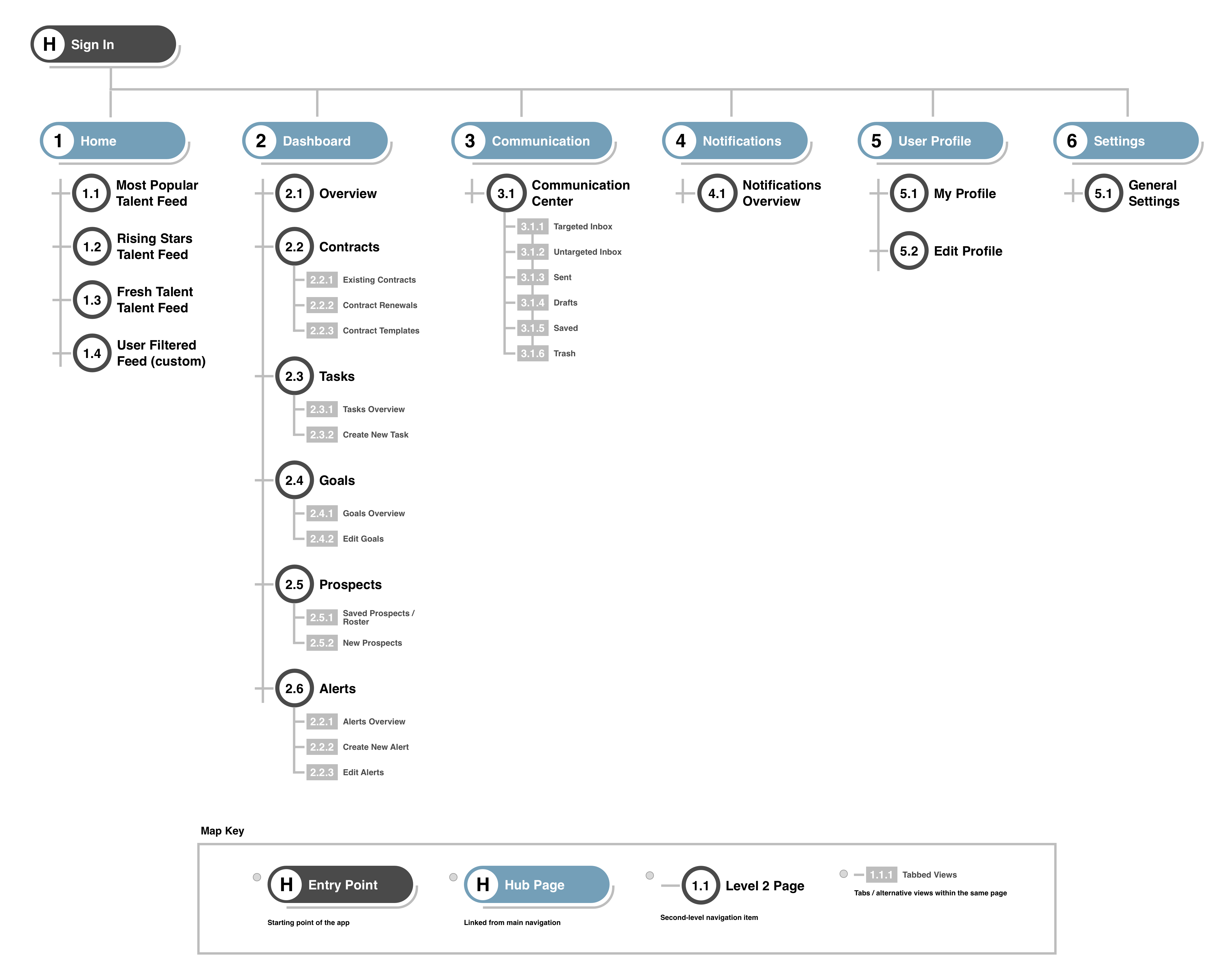
Sitemaps for Prioritized Information Architecture
Although I typically create a final sitemap once the project is complete, I like to draft sitemaps early on and iteratively update them as we continue to test our prototypes and learn more. By having them available early on, I can better keep other stakeholders in the loop as to the scope of the project, and also help developers tentatively see how we see things fitting together from an information architecture perspective.
This is the sitemap for the brand manager application that I created at the end of the project once we determined the final flow and organization of all the pages.
04
Iterative Design
Examples of prototyping, gathering feedback, and iteratively improving design concepts
Intro
Quite a bit of time was spent iterating through low-fidelity whiteboard concepts, blockframes, and clickable prototypes.
Through testing and gathering feedback, initial ideas were continually refined and eventually we reached a point of user validation.
In this section, I’ll show some of the final design choices we landed on and talk a bit about various things we tried and considered along the way and how we ultimately came to our final design choices.
Communications Center
Three iterations of how to organize & display messages
First Iteration
Second Iteration
Final Design

I like the direction but would like additional tooling/functionality for organizing the type of message an athlete sent me based on what the reason for the message was (contract renewal, gear request, etc.)
Rafael Kipka (Nike Brand Manager)
I want to be able to quickly sort between messages from targeted athletes and untargeted athletes – that’s how I primarily prioritize addressing athlete messages today
Lucy McManus (Nike Brand Manager)

Overview
Discovering Common Communication Contexts
Prioritizing Targeted vs. Untargeted Athletes
Overview
Through testing designs and gathering feedback, I discovered that brand managers think of and prioritize athlete communication in several ways.
Here are three iterations of the communication center that show how this concept evolved through iterative prototyping.
When we showed users our first iteration of the communication center, we tried to dig into their mental model of communicating with athletes and asked them how they personally think of and categorize the types of messages they send and receive.
Discovering Common Communication Contexts
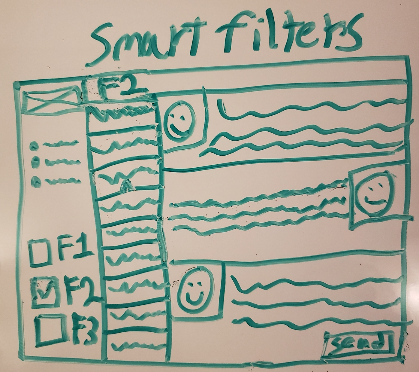
We discovered that one key aspect of a brand manager’s mental model of communicating with athletes was the type of communication. We learned that they see communication as fitting into one of four categories (ordered by priority):
1) New contracts
2) Contract renewals
3) Gear requests
4) General inquiries
In the spirit of continuous learning, we updated the journeymap we created for brand managers and added a large pain-point that brand managers were pointing out: manually determining which category a message fits into so they can prioritize which ones to respond to first.
We then created a design concept to allow brand managers to quickly identify which communication category a given message fit into (the colored dots indicating a communication category). We also created a mandatory field that athletes have to fill out when sending a new message to indicate one of these four communication types so that such a concept could be automated.
This gave brand managers a more streamlined way of scanning through incoming messages and eliminated a major pain-point in their existing journey.
Prioritizing Targeted vs. Untargeted Athletes
Digging further, we prototyped and tested this new version and continued to ask what other categorization methods brand managers think about when evaluating a new message.
We found that another key aspect of a brand manager’s mental model of communicating with athletes has to do with whether or not the athlete they are chatting with fits their recruiting targets in terms of the geography, demographic, or type of sport they are currently seeking to sponsor someone within.
This insight into a brand manager’s mental model of communication prioritization led to us creating two primary categories for messages to be contained within:
1) “Targeted”
2) “Untargeted”
Brand managers want to prioritize communicating with targeted athletes but, when time permits, they also want to have access to communication with untargeted athletes too.
Sifting through both at the same time was described as a huge current state pain point – one that we solved for with this new design concept.
Dashboard
Driving user action with need-to-know information for primary use cases
Research Summary & Design Implications
Final Design
Overview
Uncovering The Need for Prospect Alert Analysis
Fine Tuning The Display of Analytics Information
Overview
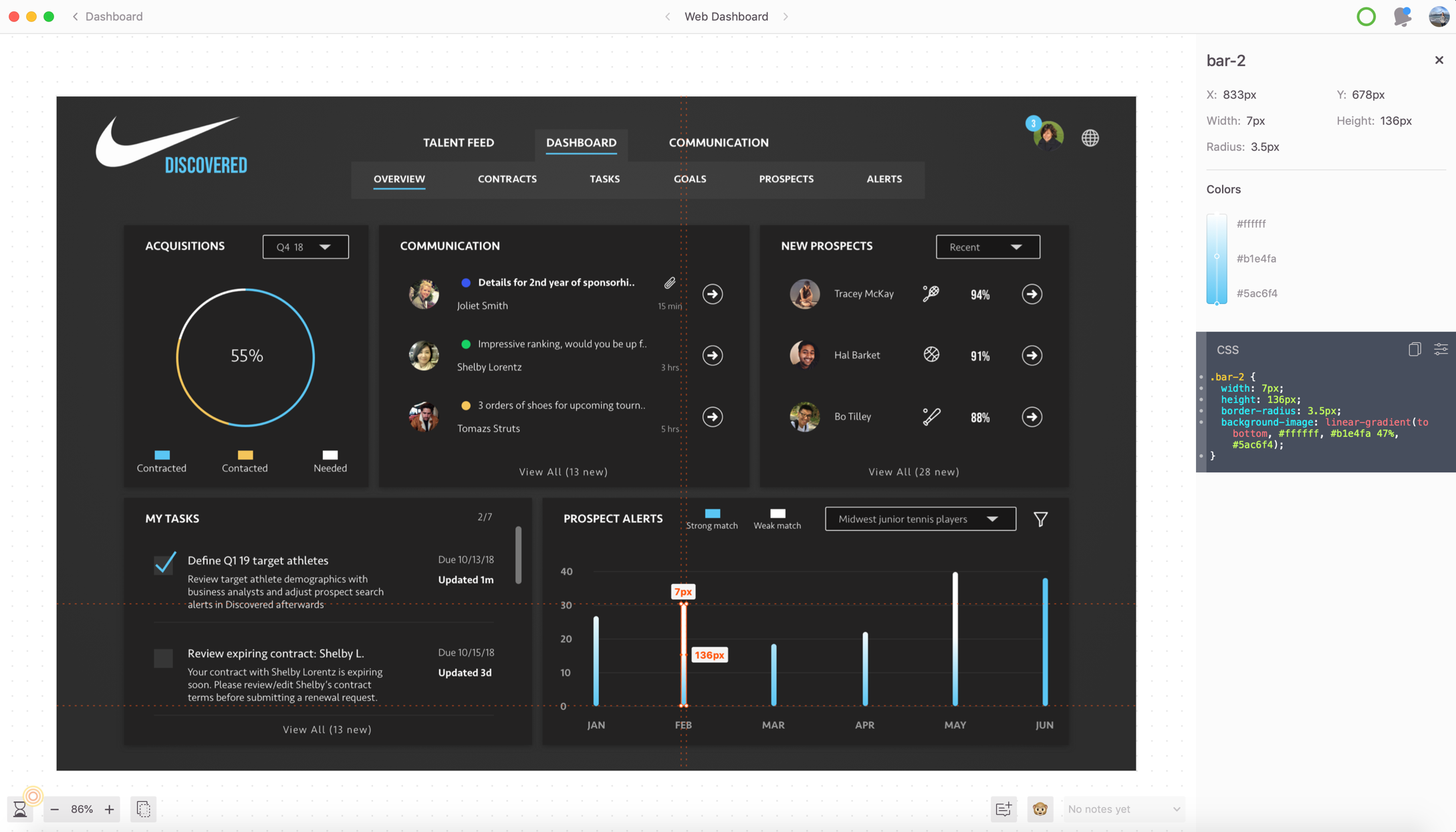
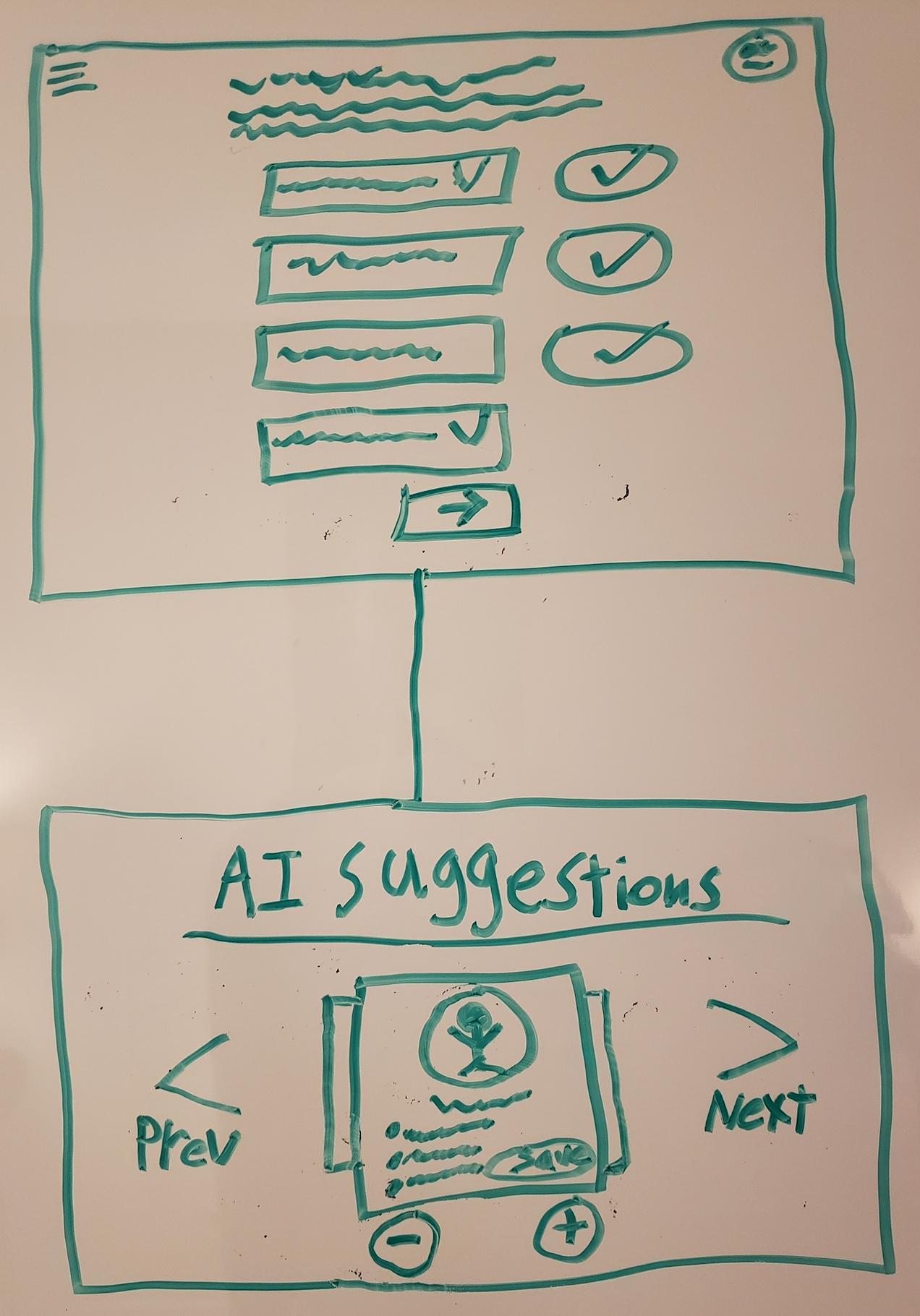
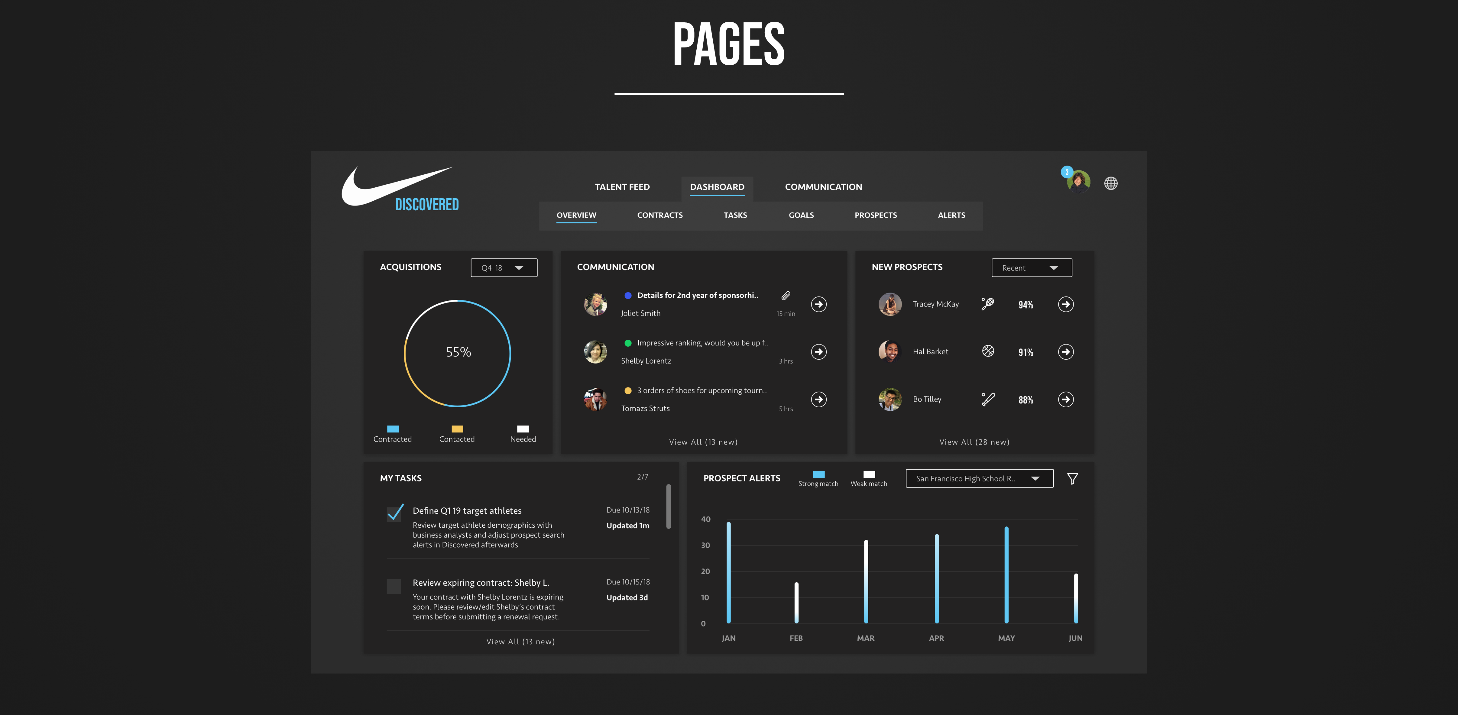
The dashboard that I ended up designing for brand managers summarizes the features and content that drive further action within the experience. It is a central repository of various pieces of information that we learned were needed to drive action towards every touch point in the overall journey of brand managers.
The idea is to have a heads-up display of the various items that would inform you of what you need to do, whether that’s responding to a message, adjusting your recruiting goals, reviewing an expiring contract, checking up on new prospects, or creating new athlete search alerts.
Initially, we didn’t truly understand all the needs that a brand manager would have and the types of information they would need to check up on frequently. However, the journeymap and persona discussed previously were incredibly influential in mapping out what pieces of information we needed to provide.
Once we had that broader look at all touchpoints, actions, and informational needs of brand managers, we took a stab at what the most pressing information to design for was – as well as how to organize it within the visual hierarchy of a dashboard page.
Uncovering The Need for Prospect Alert Analysis
One example of how we iterated through prototyping and gathering feedback was the development of the prospect alerts analysis section on this dashboard. Initially, we hadn’t included this element in the dashboard. We just hadn’t thought of it and it didn’t get explicitly mentioned in our user research.
I believe the reason for this is because it is difficult to ask users to predict their future needs when what they really need is something they’ve never been exposed to before.
The idea of measuring the effectiveness of certain prospect search alerts in terms of strength in match over time wasn’t a feature any of the brand reps we talked to had seen before.
That’s where the power of using prototypes to drive feature discussion came in.
When we were testing our athlete search alert creation page, a few users eventually said something to the extent of: “I wonder what would cause me to come back here later and change my existing athlete search alerts. How will I know if an alert I create is useful over time?”.
It was a very insightful comment, but one that didn’t come up in abstract conversation – it came up because a prototype of the dashboard with some initial ideas drove the conversation.
Prototypes can drive useful conversations with users both by what you intended to present and what you left out.
This was ideation gold. We took this comment and immediately started playing with a few ways to visually demonstrate the success/failure of athlete search alerts so that users could determine if they needed to rethink the search alerts they had defined.
Fine Tuning The Display of Analytics Information
We eventually landed on this design after discovering two things through continually gathering feedback on prototypes:
1) Success/failure of a user defined prospect search alert was determined by both the number of returned results but also the strength of relevancy in those results.
2) Nike brand reps want to be able to quickly glance at a general indication of whether they are getting a lot of search alerts for a particular type of athlete and how many of those results were a strong match.
We learned that success or failure of an athlete search alert wasn’t an exact science, but rather a more general determination that is made. This is why we went with a gradient to indicate the strength/relevancy of a match (relative to how a brand manager defined “target athlete”) along with a number scale to show the range, but we avoided explicitly calling out an exact number for the strength of certain search alerts.
Any additional specificity (such as the exact quantification of how relevant a match was) was only useful at an athlete level – not a type of search alert.
Marketing Page
Validating the overarching value proposition & designing for perception building
Prototype A
Prototype B
Final Design

I generally like what I’m seeing, but I’m confused about what “appreciation” really means. Is this just for extra exposure or does appreciation mean cash/gear rewards?
Lola Kipp (High-School Tennis Player)
Can athletes of any sport participate in this program? I’m a table tennis player and I am not sure if Nike would sponsor me because of the particular sport that I play
Bart Yoma

Overview
Validating The Idea With a Live Landing Page
Refining Our Content Messaging
Overview
Although the focus of this presentation is on the experience I designed for brand managers at Nike, it is important to recognize that the brand manager’s ability to succeed depends largely on one thing: a large user base of non-professional athletes to choose from.
That said, one key design challenge was getting non-professional athletes to be excited and sign up. This was largely done through the landing page.
Validating The Idea With a Live Landing Page
So how did we know athletes would want to sign up for Nike Discovered? We thought we had a great idea, but how did we really know? I believe that talking to target users is useful for gathering insights to generate and refine ideas, but not necessarily to validate ideas with complete confidence.
To validate the concept, we decided to set up a landing page to solicit sign ups and see if there was genuine interest by measuring the conversion rate on users signing up to be notified when the product releases.
Developing a landing page requires a lot less effort than developing the entire app and is a much quicker way to validate or invalidate a product idea.
To measure success, we were hoping for a 20% conversion rate with direct and relevant traffic (achieved by advertising to non-professional athletes on social media).
We ended up hitting around 17%, which gave us hope but also caused us to think about exploring why we fell short and what we could change before launch. This is an effort that continued with Nike’s internal team, as our statement of work ended after developing the brand manager portal and their annual consultant budget was maxed out.
Refining Our Content Messaging
Perhaps more interestingly, at least as it relates to my process, before we put the landing page up live we wanted to make sure that it clearly communicated our concept by prototyping a few versions.
We prototyped three options for the landing page. The goal was to test them out with target users and determine if they could accurately describe the intent of the website after viewing the messaging in the header.
Although we had additional information that clearly explained the concept of Nike Discovered beyond the header, we understood the value of clearly and immediately demonstrating purpose – I think this is best done above the fold (before the user is forced to scroll down).
What we wanted to learn is whether or not users 1) understood that this program was for non-professional athletes and 2) could accurately describe the 3 main value propositions for athletes (earn cash, get sponsored gear, meet other athletes).
We measured this by asking participants right off the bat to read through the header, and before they scroll any further, please tell us how you would describe Nike Discovered to a friend.
Although language can be somewhat subjective at times, we had a clear enough idea of what we hoped people thought of Nike Discovered, and after reviewing close to 120 written, qualitative answers (40 for each version) via an unmoderated usertesting.com session, we were able to quantify how many people could accurately describe Nike Discovered.
Additionally, to add color to this quantification, we also asked them to describe why they felt that way and what about the header specifically led them to that conclusion. The reason for the second question is because I believe simply quantifying responses can be misleading. Quantitative methods can be very insightful for providing insight into what happened, but not necessarily why it happened.
The underlying “why” is more powerful for designing a change. For that reason, I like to supplement quantitative analysis with qualitative analysis, such as asking people to describe what led them to their particular action / answer.
After testing these 2 prototypes of the header, we had some major takeaways about each:
For both prototypes, participants clearly understood that the site was meant for non-professional athletes.
For prototype A, people were excited by the prospect of being “appreciated” for their talent and passion, but weren’t always sure what was meant by appreciation.
Even though we mentioned the 3 value propositions, they did not appear to stand out enough and roughly 60% of participants were not able to clearly describe what the site ultimately offered athletes.
For prototype B: Roughly 70% of users were able to describe the 3 primary value propositions that we intended to communicate.
Even if prototype B ended up being more clear than prototype A, I still hesitate to conclude that it was “clear”. Being unable to quickly and clearly demonstrate our purpose to 30% of users was still a miss in my book.
So, beyond the quantitatively supported conclusion that prototype B was better, we needed insight into why it was better and how to improve it.
Looking back at the qualitative responses in the follow-up question for prototype B, we noticed we got a lot of comments that said the sentence “You don’t have to be a pro to feel like one” wasn’t clear enough. They weren’t really sure if that truly meant that amateur athletes could participate and also didn’t know what sports were acceptable (something that prototype A clearly demonstrated).
Taking this into consideration, we designed prototype C with two goals in mind: 1) clearly and concisely state that an athlete of any sport, at any level can participate and 2) create more visual emphasis on the 3 value propositions (earn cash, get sponsored gear, and meet other athletes).
We did this through reducing the total amount of text and clutter in the header to increase clarity, as well as by increasing the font weight and using the more noticeable blue color to highlight the words “cash”, “sponsored”, and “meet”.
This font color change also helped create the at-a-glance visual connection between the 3 value propositions and the program itself (“Discovered”), which allowed for more scannability.
After testing this third iteration of the prototype, we were starting to get the results we hoped for: 90% of users being able to accurately describe Nike Discovered.
Talent Feed
Testing layout effectiveness on athlete comparison
Version A
Version B
Overview
Comparing Candidates & Aligning Visual Metaphors with Intended Purpose
Overview
When brand managers first log in, they are presented with the talent discovery feed. Here, they have the ability to check out the most popular athletes, rising stars, and fresh talent. Additionally they can filter athletes by sport, geography, demographic, or whether or not an anthlete fits into one of their pre-defined filters (if they have created any).
Getting to this final design took some time. Many ideas were tested and lots of feedback was gathered that drove changes.
Comparing Candidates & Aligning Visual Metaphors with Intended Purpose
One example of iterating on this page was when we tested several layouts of the athlete feed. One layout, version A, was single-column design (one athlete per row) and the other, version B, contained two athletes per row.
On one hand, we figured that a single athlete per row would reduce cognitive load due to its cleaner design.
Conversely, we also considered that a single athlete per row layout might not metaphorically allude to the ultimate goal of the site: comparing candidates.
Through testing and gathering feedback from both versions in a think-aloud user observation where we asked users to simply explore the page and discuss what they felt the purpose of it was, we found that version B (the two item per row layout) performed better in terms of engagement/satisfaction and portraying the purpose of the site.
More time was spent exploring the feed within prototype B and the qualitative responses to our follow-up questions consistently reaffirmed the preference for version B.
Perhaps most noteably, after exploring prototype B, users consistently described Nike Discovered as a platform for discovering and comparing athletes – this comment regarding comparison did not come up nearly as much from the users that explored prototype A (the single item per row layout).
In addition to serving as a visual metaphor for the underlying purpose of the experience for brand managers (discovering and comparing talent prospects), prototype B fed into the well established Z-pattern of content scanning where users move left to right, skip a line, and repeat – an external consistency we were happy to piggyback on since it succeeded in instilling the comparison aspect of the experience.
05
UI Animation & Style
Polishing off interaction design with UI animations, creating design consistency with pattern libraries & bringing designs to fruition with style guides and developer collaboration
Intro
Above and beyond finalizing concepts, flows, and page specific features, there are a handful of other design exercises that I like to leverage to polish user interactions, create design consistency, enhance component re-usability, speed up developer workflow, and reduce potential mismatch between design and production.
In this section, I’ll share some of the work I did in regard to UI animation, design patterns, and style guides for developer hand-off.
UI Animation
Polishing off the experience with micro interaction design
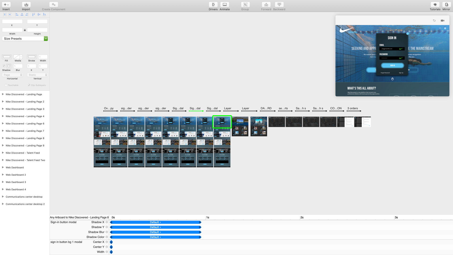
UI Animation with Principle
Featured Player Rotation
Filtering Data
Sponsored Player Rotation
Sign-in Success
Switching Messages
Micro interaction design
My philosophy is that it isn’t enough to simply hand off designs, even if they are annotated.
While design annotations are quite useful in describing interaction design, nothing quite beats the ability to actually see how each component reacts to user input.
My workflow for designing these interactions and allowing stakeholders to experience the vision for each component is to first finalize the hi-fidelity designs in Sketch, then move over to Principle to work on the detailed interaction design.
What I’ve found is that this is extremely helpful in two ways:
1) It allows me to better communicate my intended interaction design ideas to developers by actually showing the dev team what the acceptance criteria should be for a given component rather than simply describing it.
2) It creates even more buy-in from clients and helps stakeholders see the vision for the final product before it has reached a state of production (this sort of design review of course does not occur until after I’ve validated the concepts, features, and flows, as I do not want an attractive interaction to influence the feedback we receive on the fundamentals of the experience).
Design Patterns - Atomic Design
Creating designer-to-designer consistency & development efficiencies with reusable components
Overview
Atoms
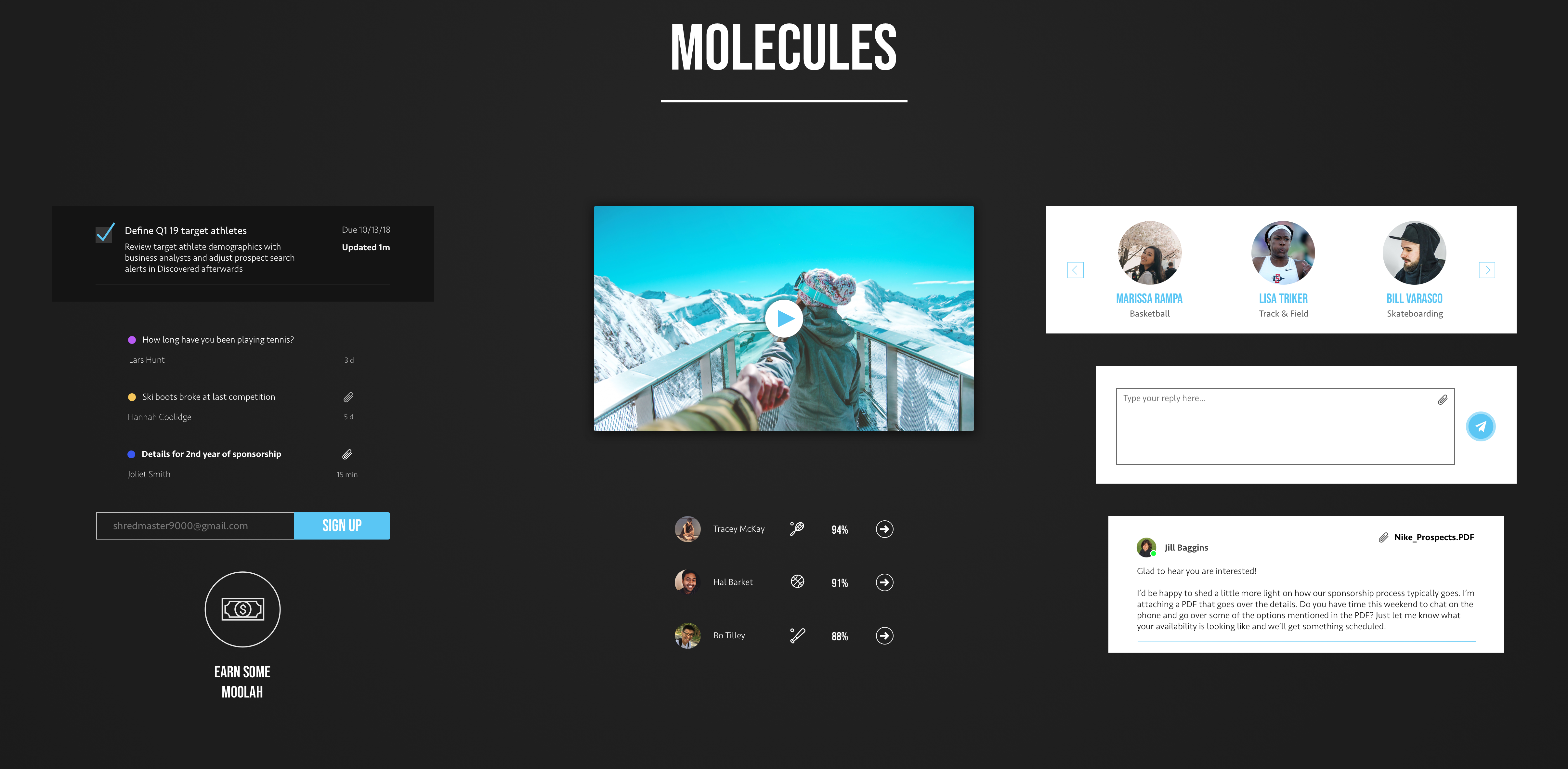
Molecules
Organisms
Templates
Pages
Overview
In order to ensure designer-to-designer consistency in the case of multiple designers working on a single project at one time (or the potential of handing off to another designer in the future), as well as to better collaborate with developers, I always create a pattern library.
In this project, we went with the Atomic Design framework to develop and maintain design patterns.
Atomic design is a design framework that I use to maintain design pattern consistency when designing new pages, centralize design choices for easy access by developers and other designers, and rapidly improve my ability to quickly prototype new ideas by choosing from existing design components as needed.
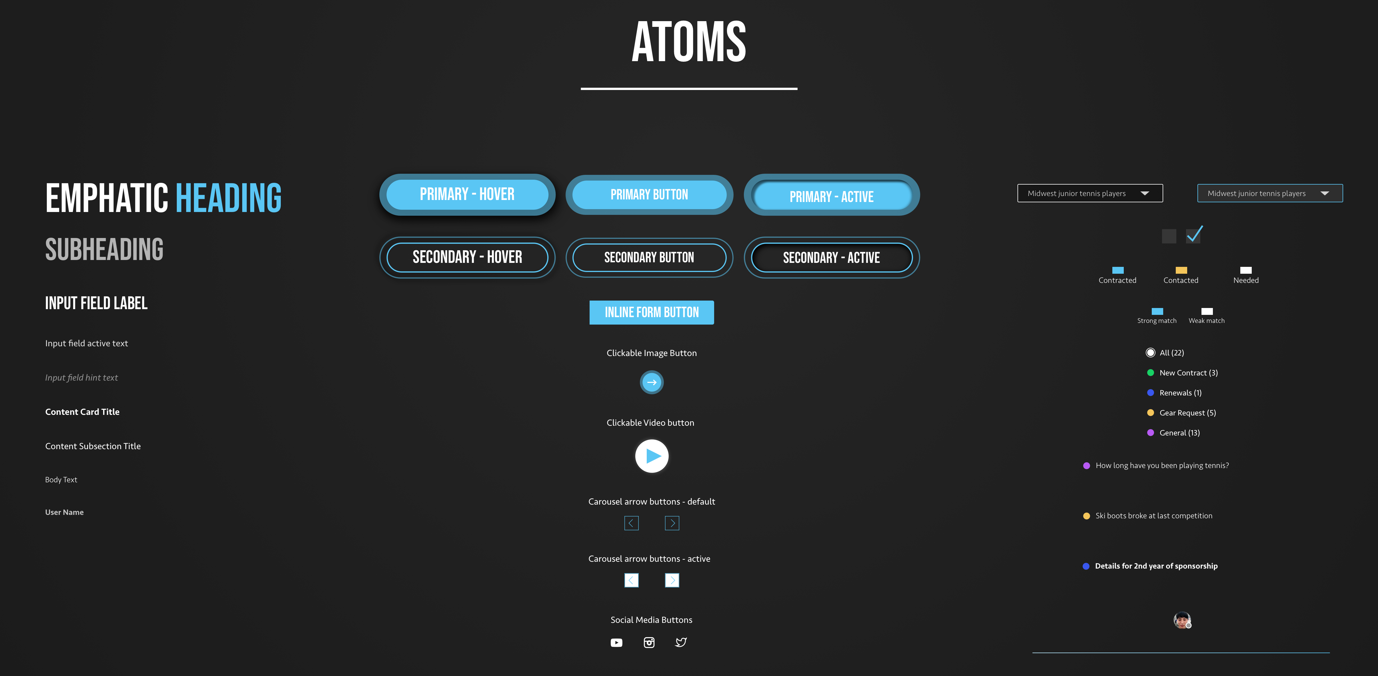
Atoms
The process starts by creating atoms. Atoms allow us to demonstrate our core design elements at the most basic level (typography choices, basic elements like buttons, dropdowns, checkboxes, etc.)
Molecules
Moving forward, atoms progress into molecules, which are slightly more complex collections of basic building blocks.
For the sake of reusability (both from a design and development perspective), I go into the creation of molecules by first referencing my existing atoms to see what I can leverage when creating a new component.
This way, I avoid creating unnecessarily unique design elements.
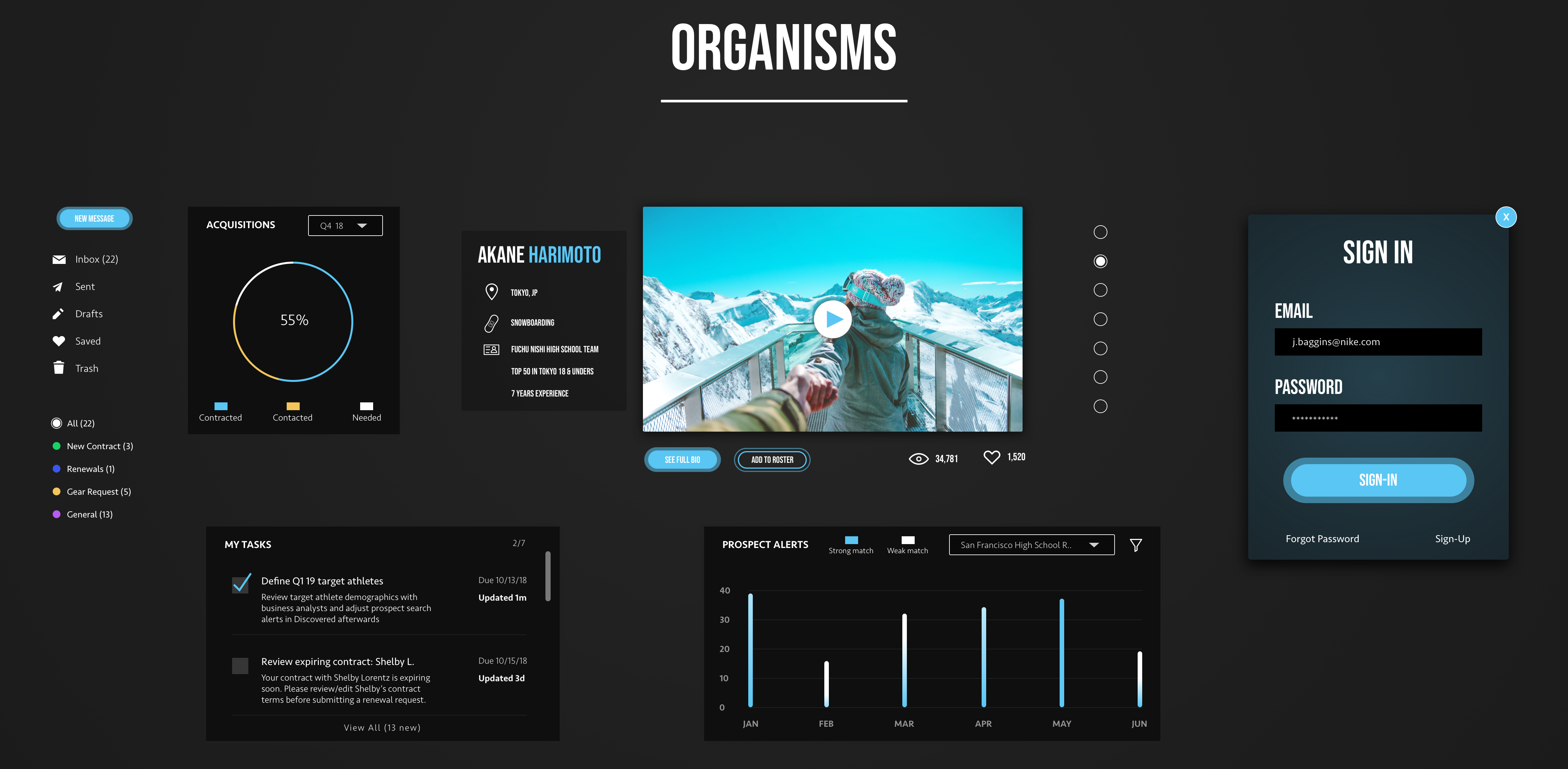
Organisms
Building in complexity, organisms are the next step after molecules.
Organisms are relatively complex UI components comprised of several molecules. Although not an entire page quite yet, organisms often describe entire sections of a page (i.e. a detailed athlete profile card within a feed of athletes).
When working with developers, I have found that it is especially helpful for them if I can (when possible) think up new organisms by combining existing molecules.
From a modular code perspective, this speeds up their workflow and allows us to ship faster.
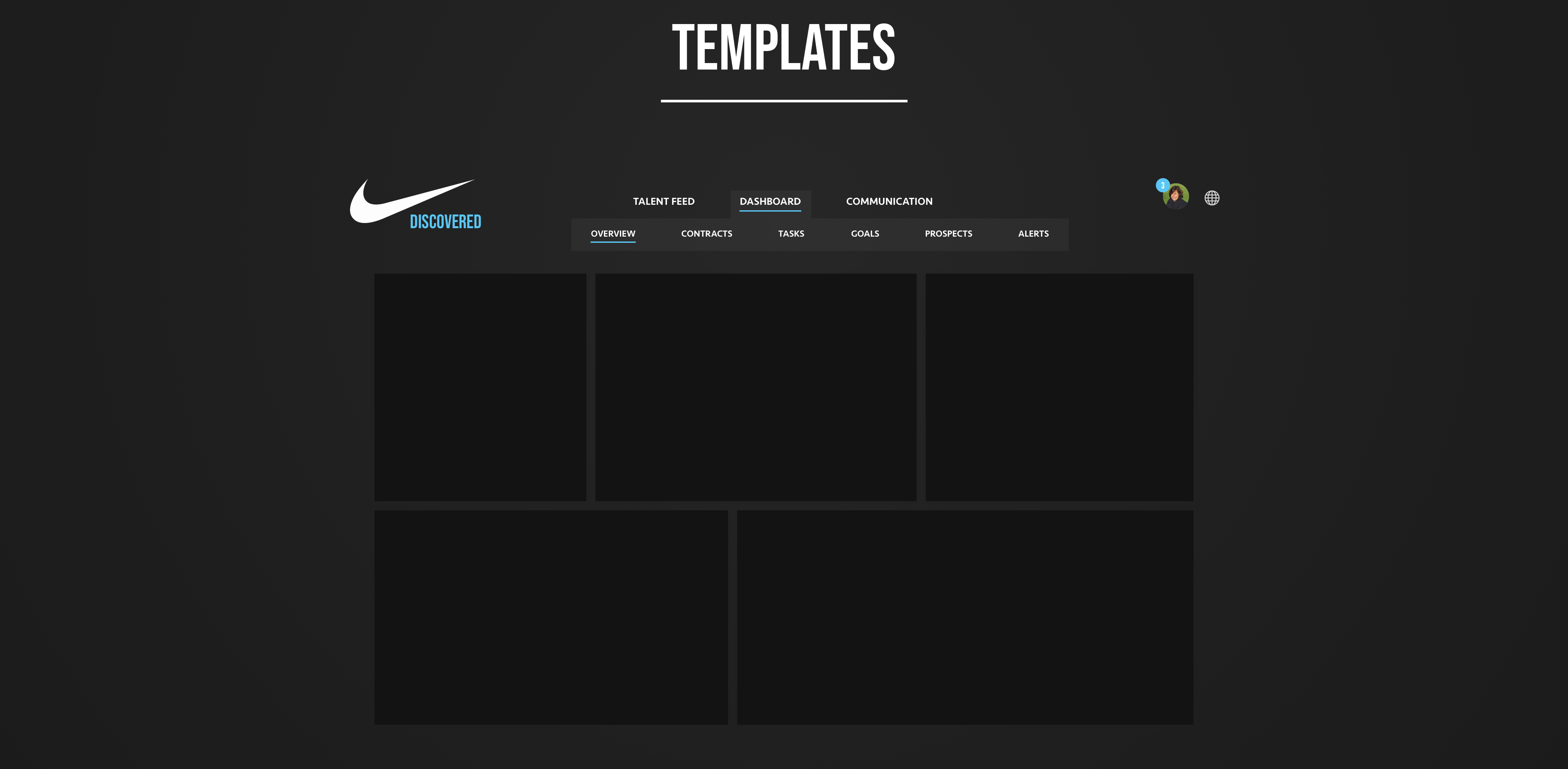
Templates
Beyond the creation of complex UI components from the building blocks of simpler design elements, the design’s underlying content structure must be determined as well.
I handle this with the creation of templates.
Templates allow me to display how the various organisms (components) fit together, which helps provide additional context for otherwise potentially abstract concepts.
Pages
The culmination of atoms, molecules, organisms, and templates is the eventual creation of a page.
Pages help us see all of our work in context with actual, meaningful content.
It’s one thing to discuss components and page structures in isolation, but as we creep towards showing our work to target users or business stakeholders, real world content goes a long way.
While a component might look good by itself in Sketch, or a page structure might make sense when discussing it at a low-fi level, the moment of truth for whether or not our design patterns truly hold up in context comes when adding in real content.
Style Guide
Collaborating with developers & ensuring designs come to fruition
Zeplin Style Guide
While I rely on my pattern library to demonstrate various components we’ve cataloged over the life of a project and I leverage my UI animations to capture how they behave under various user interactions, I still need to demonstrate specific style attributes to the dev team.
I’ve found that the easiest way to do this is by leveraging Zeplin #notanadvertisement. Zeplin allows me to quickly and consistently communicate with the dev team about specific style attributes for all aspects of the designs.
Of course, there are times when Zeplin doesn’t necessarily translate to the particular framework we may be working in (like native Android, although it does spit out React Native styles). In those cases, I work closely with developers to ensure all design attributes end up manifesting in production.
06
Project Reflections
Reflecting on some of my more notable moments during the project
Resolving Disputes & Aligning Stakeholders via User Validation
Having been through this quite a few times in various projects, I can tell you this endeavor was no different when it came to deferring to user validation to help align the many stakeholders involved. Although not a new takeaway for me, this project certainly reinstilled in me the value of gathering user feedback on prototyped ideas to help the team understand which direction is truly best.
A few examples come to mind where this situation played out during this project, but one that pops out at me in particular is when we got to designing the dashboard page for brand managers. The dashboard was a fundamental portion of the experience. It was meant to summarize the need-to-know information for brand managers so that they could take action effectively and efficiently. It was important to get this right. There was no disagreement there.
However, because it was so important, it did elicit a lot of passion amongst stakeholders on the team. Everyone got very involved in coming up with ideas for what should be displayed in the dashboard. And those ideas varied greatly.
Some folks wanted the dashboard to focus purely on a deep dive into a specific aspect of the experience, like new athlete alerts or contract management. I felt differently. I felt that the dashboard should summarize the need-to-know information from each aspect of the experience.
At first, because there were a lot of passionate cooks in the kitchen, particularly with strong voices, it was a bit difficult to logically and calmly exchange ideas and constructively challenge each other. As we were in the prototyping phase for the dashboard, this “no, I’m right!” situation went on for about a week. But I had a plan to defuse the situation and align us on a validated path for success.
While discussion was going on, I tried to act as the collective voice of the ideas that each stakeholder brought to the table — whether that was our project manager, our developers, or business stakeholders on the Nike side — and also take what I had learned in the UX research/discovery phase and create several prototypes to gather feedback on.
User validation is a powerful thing. After showing the recorded user feedback sessions for each of the prototypes (some very specific to new athlete alerts or contract management, some more broad) to the stakeholders involved, the dispute was settled and we moved forward with confidence and alignment. At the end of the road, user feedback made it quite clear that users were consistently asking for a summary view of 5 different aspects to the experience: acquisitions, communication, new prospects, tasks, and prospect alerts.